
 Latest images
SOTW #20 - WINNERS ANNOUNCED
+7
I Robzor I
PRISM
Charlie
DURC
pokeguyx
I will stop spamming
Inhaps
11 posters
Index :: Social :: Graphics :: Graphics Archive
Page 1 of 1

Which is the best entry?
SOTW #20 - WINNERS ANNOUNCED
![]() by Inhaps 24/12/2011, 11:47 am
by Inhaps 24/12/2011, 11:47 am
Rules:
Your entry must be your own work and must be made by you, ripping will not be tolerated and there will be consequences.
You may only submit one entry. If you decide to change your entry, you may edit your original post before the due date.
Your entry must be made during the submission time; no pre-made entries are allowed.
Your submission must somewhere on the signature say SOTW.
The size of the signature may not exceed 500x250 pixels horizontal, or 250x500 vertical.
No explicit images.
Prizes are as follows:
1st place - 5.5m
2nd place - 2.5m
3rd place - 1m
Public Favourite - 1m
Theme: Animals
Entry Deadline: Friday, December 30, 18:00 UTC/GMT
Post your entries here. Good luck, everyone!
___
Charlie: 1st place, Public Favourite

Broeder:
I dont know what it is, but im sorry to say i gave up on this sig the moment i saw it. It just says amateur for me. Because of a few reasons:
There just too much bright colors and no real depth.
You were a bit lazy by only doing what looks like 1 c4d, sticking it in the middle and lowering the opacity.
You didnt put a lot of effort into the finishing touch.
Kelly:
I love the render you used and how bright and active you've made it. You never surprise me with that type of thing. However, I think the graphic itself feels sort of all over the place.
Mr1inch:
I like this signature the best. The picture of Yoshi immediately because of all the effects pointing towards it. The colors are good and minimal, which makes the signature very distinguishable. Overall a really nice signature, not much more to add.
Akua: 2nd place

Broeder:
Another good sig by you. Not a lot i will say, a few things though:
Please experiment with placing text closer to the focal points and using other kinda of fonts.
Its losing a bit of contrast, also a bright too bright overall
Kelly:
I love wolves<3 This is an amazing render and you've done a great job excuting it. However, the FX on the right and left side of the wolf sort of work against you, rather than for you.
Mr1inch:
I like the picture of the wolf. The effects around it are really nice as well, they have a pattern which fits the snow-covered head of the wolf, that's why its head results so nicely in the rest of the signature. One thing I don't like is the ice, it basically comes out of nowhere and even though I completely understand your comparison (wolf -> cold -> snow -> ice) I think they are both somewhat misplaced and seem out of context. In my eyes a very worthy #2.
vection: 3rd place

Broeder:
Not a bad try, i love the vibe you created with the white fog. Also love the animals font, the sotw one not so much. One major issue with this one is that there is no real strong focal point.
Kelly:
I like the fact that you put a bit of a description next to what you have, but it almost works against you, as it takes focus off of the render and onto the text. I do, however, like your text in the lower right hand corner.
Mr1inch:
I like how you kept the signature very dark, very original, usually signatures are always very bright but yours is kept nice and smooth with very minimal colors, I do find however that it may be a bit 'too dark', even though I can clearly see you tried to let the horse 'pop out' I feel that you didn't succeed like I hoped you would. The horse almost becomes a part of the landscape and the legs look very odd in my opinion as well. Alsot, you gotta love the poem. Some people like this additional factors to their signature, some don't. Overall a good signature that just didn't did the trick for me, but may very well do this for a lot of other people.
I Robzor I

Broeder:
The subtle fx you put in it are kinda cool, but you didnt transform the stock correctly. Its a bit squished, also the text is totally counterflow.
Kelly:
The FX you used don't really work well there and the overall graphic needs a bit of improving, such as giving better depth. However, I like the render you used.
Mr1inch:
I like how you kept the colors a little red-ish, this characterizes the colors of Africa and the savanna, which immediately comes to mind when you think about a tiger. A few inadequacies that I find however are for instance the more light end of his left foot. It seems somewhat misplaced and it looks a bit like a long fingernail. I love what you did with the right side of the signature, I really do. It is very light and very minimal with the colors used, which makes every object really distinguishable. The left side however you added a sort of shade which I find somewhat misplaced. It doesn't really influence the signature positively unfortunately - shame :/
Your entry must be your own work and must be made by you, ripping will not be tolerated and there will be consequences.
You may only submit one entry. If you decide to change your entry, you may edit your original post before the due date.
Your entry must be made during the submission time; no pre-made entries are allowed.
Your submission must somewhere on the signature say SOTW.
The size of the signature may not exceed 500x250 pixels horizontal, or 250x500 vertical.
No explicit images.
Prizes are as follows:
1st place - 5.5m
2nd place - 2.5m
3rd place - 1m
Public Favourite - 1m
Theme: Animals
Entry Deadline: Friday, December 30, 18:00 UTC/GMT
Post your entries here. Good luck, everyone!
___
Charlie: 1st place, Public Favourite
Broeder:
I dont know what it is, but im sorry to say i gave up on this sig the moment i saw it. It just says amateur for me. Because of a few reasons:
There just too much bright colors and no real depth.
You were a bit lazy by only doing what looks like 1 c4d, sticking it in the middle and lowering the opacity.
You didnt put a lot of effort into the finishing touch.
Kelly:
I love the render you used and how bright and active you've made it. You never surprise me with that type of thing. However, I think the graphic itself feels sort of all over the place.
Mr1inch:
I like this signature the best. The picture of Yoshi immediately because of all the effects pointing towards it. The colors are good and minimal, which makes the signature very distinguishable. Overall a really nice signature, not much more to add.
Akua: 2nd place
Broeder:
Another good sig by you. Not a lot i will say, a few things though:
Please experiment with placing text closer to the focal points and using other kinda of fonts.
Its losing a bit of contrast, also a bright too bright overall
Kelly:
I love wolves<3 This is an amazing render and you've done a great job excuting it. However, the FX on the right and left side of the wolf sort of work against you, rather than for you.
Mr1inch:
I like the picture of the wolf. The effects around it are really nice as well, they have a pattern which fits the snow-covered head of the wolf, that's why its head results so nicely in the rest of the signature. One thing I don't like is the ice, it basically comes out of nowhere and even though I completely understand your comparison (wolf -> cold -> snow -> ice) I think they are both somewhat misplaced and seem out of context. In my eyes a very worthy #2.
vection: 3rd place
Broeder:
Not a bad try, i love the vibe you created with the white fog. Also love the animals font, the sotw one not so much. One major issue with this one is that there is no real strong focal point.
Kelly:
I like the fact that you put a bit of a description next to what you have, but it almost works against you, as it takes focus off of the render and onto the text. I do, however, like your text in the lower right hand corner.
Mr1inch:
I like how you kept the signature very dark, very original, usually signatures are always very bright but yours is kept nice and smooth with very minimal colors, I do find however that it may be a bit 'too dark', even though I can clearly see you tried to let the horse 'pop out' I feel that you didn't succeed like I hoped you would. The horse almost becomes a part of the landscape and the legs look very odd in my opinion as well. Alsot, you gotta love the poem. Some people like this additional factors to their signature, some don't. Overall a good signature that just didn't did the trick for me, but may very well do this for a lot of other people.
I Robzor I
Broeder:
The subtle fx you put in it are kinda cool, but you didnt transform the stock correctly. Its a bit squished, also the text is totally counterflow.
Kelly:
The FX you used don't really work well there and the overall graphic needs a bit of improving, such as giving better depth. However, I like the render you used.
Mr1inch:
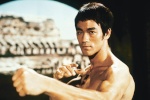
I like how you kept the colors a little red-ish, this characterizes the colors of Africa and the savanna, which immediately comes to mind when you think about a tiger. A few inadequacies that I find however are for instance the more light end of his left foot. It seems somewhat misplaced and it looks a bit like a long fingernail. I love what you did with the right side of the signature, I really do. It is very light and very minimal with the colors used, which makes every object really distinguishable. The left side however you added a sort of shade which I find somewhat misplaced. It doesn't really influence the signature positively unfortunately - shame :/
Last edited by Inhaps on 23/1/2012, 4:32 pm; edited 4 times in total

Inhaps- Grandmaster (2000 posts)
")

I will stop spamming- Tier 2 (100 posts)
")
Re: SOTW #20 - WINNERS ANNOUNCED
![]() by Inhaps 24/12/2011, 2:20 pm
by Inhaps 24/12/2011, 2:20 pm
spam wrote:real animals?
Whatever you'd call an animal.
Inhaps- Grandmaster (2000 posts)
Re: SOTW #20 - WINNERS ANNOUNCED
![]() by pokeguyx 24/12/2011, 9:06 pm
by pokeguyx 24/12/2011, 9:06 pm
I'm entering in a few hours - Well, I hope too 
I'm making one with a dragon in, I believe that counts as some kind of animal?
I'm making one with a dragon in, I believe that counts as some kind of animal?

pokeguyx- Grandmaster (2000 posts)
Re: SOTW #20 - WINNERS ANNOUNCED
![]() by DURC 24/12/2011, 11:23 pm
by DURC 24/12/2011, 11:23 pm
You generally refer to such things as "mythical creatures/beasts", as a public member that enjoys following SOTW I personally would prefer to see such 'animals' as a separate category and have this one purely for real animals, but that's just my opinion and I doubt it will be considered

DURC- Forum Master (1500 posts)
")
Re: SOTW #20 - WINNERS ANNOUNCED
![]() by Charlie 29/12/2011, 3:40 pm
by Charlie 29/12/2011, 3:40 pm
Made a vector-style Tiger sig but didn't really like it.
If you don't consider Yoshi to be an animal, I can go with the Tiger one.
If you don't consider Yoshi to be an animal, I can go with the Tiger one.

Charlie- Grandmaster (2000 posts)
Re: SOTW #20 - WINNERS ANNOUNCED
![]() by I Robzor I 30/12/2011, 3:15 pm
by I Robzor I 30/12/2011, 3:15 pm
I decided to do a last minute entry, went for the shabby/worn out look. Struggled finding a good render/picture to use but thought i'd throw this one in.

I Robzor I- Tier 2 (100 posts)
Re: SOTW #20 - WINNERS ANNOUNCED
![]() by vection 31/12/2011, 12:30 am
by vection 31/12/2011, 12:30 am
Stock's used -
- Spoiler:

and
Oh and my suggestion is to make a rule showing the stock image you have used, so that the judges know exactly how much work was put into the making of the signature.

vection- Tier 2 (100 posts)
Re: SOTW #20 - WINNERS ANNOUNCED
![]() by PRISM 2/1/2012, 2:37 pm
by PRISM 2/1/2012, 2:37 pm
I think thats a great idea vection.
Inhaps, thanks for your effort promoting every week the sotw competition. I know its not easy to do + it´s time consuming. Just a thank you post.
 cheers!
Inhaps, thanks for your effort promoting every week the sotw competition. I know its not easy to do + it´s time consuming. Just a thank you post.

PRISM- Forum Master (1500 posts)

Lucky- Grandmaster (2000 posts)
iFlipitRaw- Tier 2 (100 posts)
Charlie- Grandmaster (2000 posts)
Re: SOTW #20 - WINNERS ANNOUNCED
![]() by Kelly 18/1/2012, 4:58 pm
by Kelly 18/1/2012, 4:58 pm
Sorry for the long wait with this one, guys! However, they are currently being critiqued now, so the top three winners shall be listed not too long from now
Very nice entries, guys!
Very nice entries, guys!

Kelly- Grandmaster (2000 posts)
Inhaps- Grandmaster (2000 posts)
» ~*~ SOTW #33 ~*~ WINNERS ANNOUNCED
» ~*~ SOTW #46 ~*~ WINNERS ANNOUNCED
» ~*~ SOTW #21 ~*~ WINNERS ANNOUNCED!
» ~*~ SOTW #34 ~*~ WINNERS ANNOUNCED
» ~*~ SOTW #47 ~*~ WINNERS ANNOUNCED
» ~*~ SOTW #46 ~*~ WINNERS ANNOUNCED
» ~*~ SOTW #21 ~*~ WINNERS ANNOUNCED!
» ~*~ SOTW #34 ~*~ WINNERS ANNOUNCED
» ~*~ SOTW #47 ~*~ WINNERS ANNOUNCED
Index :: Social :: Graphics :: Graphics Archive
Page 1 of 1
Permissions in this forum:
You cannot reply to topics in this forum|
|
|