
 Latest images
SOTW #71 (double prizes) - WINNERS ANNOUNCED
5 posters
Index :: Social :: Graphics :: Graphics Archive
Page 1 of 1

Which is the best entry?
SOTW #71 (double prizes) - WINNERS ANNOUNCED
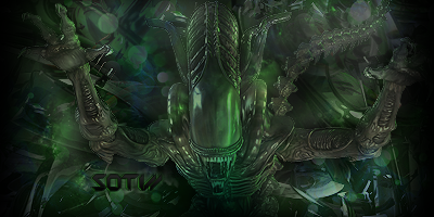
![]() by Inhaps 15/3/2013, 9:13 pm
by Inhaps 15/3/2013, 9:13 pm
SOTW #71
Rules:
Your entry must be your own work; no stealing other people's work or entering in pre-made graphics
In the signature, please put SOTW or what the theme is for the text
No animated entries, explicit images, text, or contents
Please include the render/stock used or a screen shot of the image in the program you used. You do not have to put up both.
Sizes are not super strict, please just try not to exceed 500x350 (or if vertical 350x500).
When in voting, you may not persuade others to vote for your entry, or vote for your own.
Prizes:
1st place: 10M
2nd place: 7M
Public favorite: 3M
Judging System
There will be three professional judges every week, one of those outside gdt. If you wish to be judge, feel free to apply.
Regular guest judges get halfop in #Sm_graphics
This is what the judges will be looking at so make sure you know! Each Section will be for a total of 10 points 40 total.
- Spoiler:
*Idea
--Concept
--Composition
*Technical
--Flow
--Depth
--Lighting
*Typography
--Quality
--Integration
*Execution
--Balance
--Overall quality
Entry Deadline: March 22
Be Inspired

owner of this piece link
Entries:
First place and public favourite: A Crayon

Proof: [x]
total: 74/120
- Inhaps' critique - 24:
- Idea: 8/10
The idea in itself is very simple but effective with the scene being a possible allusion to the film Prometheus.
Technical: 6/10
The effects used in the more distant darker background are remarkably eye-pleasing but not so much when it is used on the lighter parts in the front, which creates a rather cheap feel to it, especially in conjunction with the lighting effects around the alien.
Typography: 4/10
Hardly the strongest point of the piece. It is not very legible yet draws a lot of attention what with the seemingly random black box that doesn't feel like it belongs where it is.
Execution: 6/10
It suffers heavily from colour balancing issues. As a whole, it is not great but had a lot of potential if one has a look at the darker parts of it that have really great contrast to them.
- Broeder’s critique – 25:
- Idea: 8/10
Cant go wrong with that render in this theme, and i appreciate the effort of trying to position him in a real landscape
Technical: 6/10
Techniques used are interesting and not often seen. They would have helped the sig a lot more if used more subtle though. Lighting effects around the render pretty much ruin the piece
Typography: 5/10
The block just doesnt it, and especially not with this placement.
Execution: 6/10
The colors should have been given more attention, it works in some rare sections but as a whole doesnt make this sig 'eyecandy' so to say.
- Tuff's critique – 25:
- Idea: 8/10
I like your choice of render and background.
Technical: 7/10
Choose one specific spot for lighting. I see from the top as well from the bottom. Tone down on the effects you used here.
Typography: 4/10
Very hard to read and very strange placement. Next time don't use the box effect.
Execution: 6/10
As Broeder stated, focus on the colours there. I see some blues here and there. Would have made your piece more appealing.
Second place: Leakee
Proof: [x]
total: 73/120
- Inhaps' critique - 23:
- Idea: 6/10
Apparently, the idea was to give it that cramped, claustrophobic feel that the Aliens franchise is so fond of, but the abstract background is a bit too abstract to achieve it well.
Technical: 5/10
The greenish overlay hurts the already lacking contrast the render has initially, notably the very bottom part of the render. It could benefit from a different layer blending option, so as to not look like it has been slapped on there without much thought.
Typography: 6.5/10
The typography is appropriate even if rather uninspired. It is probably the stronger part of the piece.
Execution: 5.5/10
It looks very much like a scene from an early 2000s video game. The render really could have used some contrast adjustments.
- Broeder’s critique – 26:
- Idea: 7/10
Render fits the theme, color scene sets a mood which helps this sig a lot
Technical: 6.5/10
The background isn't bad, the black around the edges just gives it all a pretty amateuristic vibe. Could have given more effort to creating a stronger focal point
Typography: 6.5/10
A good example that simple can work, its not bad text at all.
Execution: 6/10
Technically not a very good sig, but it works and all elements are equally good/bad so it fits.
- Tuff's critique – 24:
- Idea: 7/10
Good choice of render and placement.
Technical: 6/10
You should have more the focal point more evident and add more lighting to it.
Typography: 6/10
Simple, easy to read. Not much more to say.
Execution: 5/10
Too much green and adds an 'eh' to my thoughts.
Last edited by Inhaps on 20/4/2013, 8:34 am; edited 5 times in total

Inhaps- Grandmaster (2000 posts)
")
Re: SOTW #71 (double prizes) - WINNERS ANNOUNCED
![]() by Broeder 15/3/2013, 9:13 pm
by Broeder 15/3/2013, 9:13 pm
Loving the theme we got for you for this week guys!

Broeder- Grandmaster (2000 posts)
Re: SOTW #71 (double prizes) - WINNERS ANNOUNCED
![]() by Broeder 22/3/2013, 10:35 am
by Broeder 22/3/2013, 10:35 am
Will be extended for an extra week, cant wait to see what you guys can come up with!
Broeder- Grandmaster (2000 posts)

Crayons.- Tier 3 (300 posts)
")
Re: SOTW #71 (double prizes) - WINNERS ANNOUNCED
![]() by Leakee 23/3/2013, 9:30 pm
by Leakee 23/3/2013, 9:30 pm
Will edit post with video...

Leakee- Grandmaster (2000 posts)
-

Re: SOTW #71 (double prizes) - WINNERS ANNOUNCED
![]() by Broeder 27/3/2013, 4:27 pm
by Broeder 27/3/2013, 4:27 pm
Half a week left, dont forget to enter for a chance of the double prizes!
Broeder- Grandmaster (2000 posts)
Re: SOTW #71 (double prizes) - WINNERS ANNOUNCED
![]() by Blackyy 28/3/2013, 2:01 am
by Blackyy 28/3/2013, 2:01 am
Leakee wrote:Proof is being uploaded to my YouTube channel in the form of a speedart, hope this classes as proof?
Will edit post with video...
im glad I am not alone with RollerCoaster 2 still installed
btw you are running out of disk space noob.
Blackyy- Forum Master (1500 posts)
")
Re: SOTW #71 (double prizes) - WINNERS ANNOUNCED
![]() by Leakee 28/3/2013, 7:01 am
by Leakee 28/3/2013, 7:01 am
Blackyy wrote:Leakee wrote:Proof is being uploaded to my YouTube channel in the form of a speedart, hope this classes as proof?
Will edit post with video...
im glad I am not alone with RollerCoaster 2 still installed
btw you are running out of disk space noob.
Yeah, im going to need a new Pc soon :3
Leakee- Grandmaster (2000 posts)
-
Re: SOTW #71 (double prizes) - WINNERS ANNOUNCED
![]() by Blackyy 15/4/2013, 7:43 am
by Blackyy 15/4/2013, 7:43 am
Leakee wrote:Blackyy wrote:Leakee wrote:Proof is being uploaded to my YouTube channel in the form of a speedart, hope this classes as proof?
Will edit post with video...
im glad I am not alone with RollerCoaster 2 still installed
btw you are running out of disk space noob.
Yeah, im going to need a new Pc soon :3
reformat..
Blackyy- Forum Master (1500 posts)
» ~*~ SOTW #49 ~*~ WINNERS ANNOUNCED (DOUBLE PRIZES)
» ~*~ SOTW #54 ~*~ WINNERS ANNOUNCED [DOUBLE PRIZES]
» SOTW #19 - WINNERS ANNOUNCED
» ~*~ SOTW #32 ~*~ WINNERS ANNOUNCED!
» ~*~ SOTW #45 ~*~ WINNERS ANNOUNCED
» ~*~ SOTW #54 ~*~ WINNERS ANNOUNCED [DOUBLE PRIZES]
» SOTW #19 - WINNERS ANNOUNCED
» ~*~ SOTW #32 ~*~ WINNERS ANNOUNCED!
» ~*~ SOTW #45 ~*~ WINNERS ANNOUNCED
Index :: Social :: Graphics :: Graphics Archive
Page 1 of 1
Permissions in this forum:
You cannot reply to topics in this forum|
|
|