
 Latest images
~*~ SOTW #42 ~*~ WINNERS ANNOUNCED
Index :: Social :: Graphics :: Graphics Archive
Page 1 of 3 • 1, 2, 3 ![]()

~*~ SOTW #42 ~*~ WINNERS ANNOUNCED
![]() by Kelly 16/6/2012, 6:35 pm
by Kelly 16/6/2012, 6:35 pm
- Your entry must be your own work and made by you; stealing other people's work will not be tolerated.
- Your graphic cannot be pre-made. The graphic must have been created during the allotted time.
- Within the signature you submit you must have it say SOTW or what the theme is.
- No animated graphics, explicit images, text, or contents.
- Must follow all Smokin Mils rules (found here).
- Your submission must not be any larger than 500x225 (may change next SOTW, to take part in the dispute about this click here)
- When voting is up, you may not persuade others to vote for your entry. The object is to have people choose what they like the most and\or feel is the best
- You must post up all images you used to help you created your work. If you did not use any images to help create your graphic, you must show proof by taking a picture of your screen with the program(s) you used to create the graphic (you MUST have the layers tab up and showing; it may not be crossed out, blurred, or blocked in any way, shape, or form) and\or a screenshot where you can see this thread and the graphic you worked on. Failure to prove your work is your own and\or failure to show renders, stock images, C4Ds, or any other images used to help create your graphic will result in your entry becoming void.
Prizes:
- 1st place: 5M
- 2nd place: 3M
- 3rd place: 1M
- Public favorite: 1M
Theme: Freestyle
Entry Deadline: Friday, June 22, 2012
~ * ~ * ~ * ~ * ~ * ~ * ~ * ~ * ~ * ~ * ~ * ~ * ~ * ~ * ~ * ~ * ~ * ~ * ~ * ~ * ~ * ~
First place and public favorite: Stealth

Proof: [x], [x]
- DoYouPlay_RS Guest Critique:
Theme: 10
Lighting, Flow, Depth: 7, really nice job with the smudging, but it looks like he is flying XD Also, never make the render’s face really close to an edge and facing it. Just doesn’t look right to me.
Typography: 10, awesome location, font choice, and colour.
Creativity: 8, really nice smudging.
Overall feel/look/effectiveness/composition: 8, awesome job as usual.
Other:
- Jiri Critique:
Theme: 10
Lighting, Flow, Depth: 8, really nice blending here, looks good! Lightning is also good!
Typography: 9, good job on this one, effects placement and font is good. PS: I'd like to see you use another font next time though, correct me if I'm wrong, but I've seen you use this font quite a lot, can't say much on this one, fits it perfectly!
Creativity: 7, like the scenery effect you created!
Overall feel/look/effectiveness/composition: 8, a bit too much of the sharpen effect in my eyes
Other:
- Inhaps Critique:
Theme: 10
Lighting, Flow, Depth: 8, good, although the beige smudges are slightly too excessive.
Typography: 10, the looks and placements are both great.
Creativity: 8, the black border could’ve been bigger and the render moved a little lower.
Overall feel/look/effectiveness/composition: 8, too much sharpening, and also it’s too large for its own good.
- Grim IReaper:
Theme: (8)
Lighting, Flow, Depth: (8)
Typography: (7) Simple enough not to take focal from the render, and looks like it belongs there. Good job.
Creativity: (8)
Overall feel/look/effectiveness/composition: (9) Beautifully made signature. Very bright, and vibrant. I don't think your recent work has shown your true skill, but I think this week you've out done yourself. Good job, my favourite piece this week.
Second place: Todgott

Proof: [x]
- DoYouPlay_RS Guest Critique:
Theme: 10
Lighting, Flow, Depth: 9, really good except for the smudge of purple on the right and the fact the way the render is facing. Look at stealth’s judging for more.
Typography: 6, hard to read
Creativity: 8
Overall feel/look/effectiveness/composition: 8, nice job with the gradient map
Other:
- Jiri Critique:
Theme: 10
Lighting, Flow, Depth: 9, all looks very good here, can't say anything bad about it
Typography: 6, placement & font are good, but it's hard to read, mayby a bit darker effect could've made it more readable
Creativity: 7, like the overall concept
Overall feel/look/effectiveness/composition: 8, dislike the border color a bit, and I think it's a wierd render choise, haven't seen the original but the fact it's so monotome makes it lose a bit of it's personality I think.
Other:
- Inhaps Critique:
Theme: 10
Lighting, Flow, Depth: 9, the huge purple spot feels odd.
Typography: 8, it looks really great but it’s difficult to actually read.
Creativity: 10, everything’s very well blended together, and main render’s colours are really well edited.
Overall feel/look/effectiveness/composition: 9
- Grim IReaper:
Theme: (8)
Lighting, Flow, Depth: (9) I don't think anyone will beat you for marks in this category. Your one of my favourite traditionalists on these forums, and it's easy to see why looking at this weeks entry.
Typography: (6) A little hard to see, and looks a lot like the text on some of your previous entries. Maybe be a little more creative with the font next week.
Creativity: (8)
Overall feel/look/effectiveness/composition: (8) Another great entry. Not a big fan of the colours though.
SIDE NOTE: Not sure if this was your mistake, but as proof, Kelly re-posted your signature. If this wasn't a mistake by her, can you please post a screenie revealing your layers, your main resources used, or a GIF image revealing your layers one-by-one.
Third place: xDamon

Proof: [x]
- DoYouPlay_RS Guest Critique:
Theme: 10
Lighting, Flow, Depth: 9, I love this first off. My eyes go where they need to go and there is a good flow to it.
Typography: 6, Very hard to read but still nice.
Creativity: 9, some really creative effects in there.
Overall feel/look/effectiveness/composition: 8, very nice entry this week.
Other: Also, floating eyes are creeping me out in the top right
- Jiri Critique:
Theme: 10
Lighting, Flow, Depth: 8 all looks good here.
Typography: 7, it's a bit hard to read, I see you used a clipping mask, try to play around with the effects to make it a bit darker so it's more readable, you'll still have the same effect
Creativity: 7, nice!
Overall feel/look/effectiveness/composition: 8, good entry from you, mayby a bit more contrast and some work on the text
Other:
- Inhaps Critique:
Theme: 10
Lighting, Flow, Depth: 7, the lighting is good but it lacks contrast and depth.
Typography: 6, fancy but hardly readable.
Creativity: 7, very simplistic and pretty but seeing multiples of the same face is very freaky, especially the faint eyes in the background.
Overall feel/look/effectiveness/composition: 7
- Grim IReaper:
Theme: (7)
Lighting, Flow, Depth: (7)
Typography: (6) A little hard to see.
Creativity: (7)
Overall feel/look/effectiveness/composition: (7)
D avy
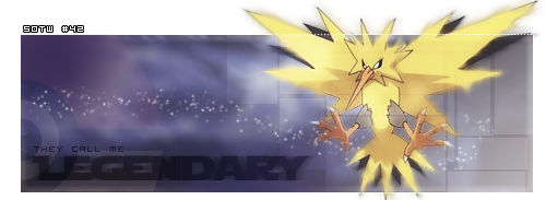
Proof: [x]
- DoYouPlay_RS Guest Critique:
Theme: 10
Lighting, Flow, Depth: 4, no depth or lighting visible, though white dots were added.
Typography: 6, didn’t really notice SOTW #42 at first but I can see why you did that. I find the black text blurry and a tad hard to read.
Creativity: 8, matches the Zapdos feel, nice job with the background
Overall feel/look/effectiveness/composition: 6, could have had more effects.
Other:
- Jiri Critique:
Theme: 10
Lighting, Flow, Depth: 4, needs more work here, render isn't really worked in with the background and barely any work on the lightning.
Typography: 6, the text in the actual signature is good, placement could be a bit better though. Try to keep text inside the signature and not outside it.
Creativity: 7, kinda like it but I think it could use a more electric theme.
Overall feel/look/effectiveness/composition: 6
Other:
- Inhaps Critique:
Theme: 10
Lighting, Flow, Depth: 4, no depth or lighting, really. The white trail is just about the only thing that’s beneficial to the flow to some degree.
Typography: 5, the main text looks nice but could be slightly more opaque, while the grey pixel text is almost unreadable.
Creativity: 6, the render really does not look great with all the smudging, plus it’s cut off at the edges of the image. The white dotted border could’ve been better with a different blending option applied to it.
Overall feel/look/effectiveness/composition: 5
- Grim IReaper:
Theme: (6)
Lighting, Flow, Depth: (5)
Typography: (6)
Creativity: (4)
Overall feel/look/effectiveness/composition: (5)
CP4E

Proof: [x], [x]
- DoYouPlay_RS Guest Critique:
Theme: 10
Lighting, Flow, Depth: 6, good flow/lighting, not a lot of depth visible imo.
Typography: 5, text is too far away from him and draws attention away. Font doesn’t match whatsoever, and the game has no purpose other than to make me lose the game. Dammit.
Creativity: 7, the grungy effect looks really nice with a sig like this.
Overall feel/look/effectiveness/composition: 6, looks kind of plain but not to the point where its super plain. The text makes me feel “intimidated” by the signature.
Other:
- Jiri Critique:
Theme: 10
Lighting, Flow, Depth: 3, lightning is very weird here, render has some lightning however I the lightning was already on the render, because the bg has no lightning.
Typography: 4, placement could be better, would've worked better if you got the SOTW in the same style as 'The Game', font of SOTW also doesn't match the theme.
Creativity: 6, I like the idea
Overall feel/look/effectiveness/composition: 5, sig is a bit too small and lightning is wrong.
- Inhaps Critique:
Theme: 10
Lighting, Flow, Depth: 2, the guy’s supercontrasted while the background just looks odd. Nothing was changed to improve that.
Typography: 4, the SOTW text has a horribly unfitting font and the placement isn’t the greatest either.
Creativity: 4, the white strips with THE GAME text are great but the rest is subpar. The patterned square acts well as a filler, but its yellow glow is just horrid. Very little has actually been done with it.
Overall feel/look/effectiveness/composition: 3, it’s far too small for its own good.
- Grim IReaper:
Theme: (5)
Lighting, Flow, Depth: (4)
Typography: (6)
Creativity: (6)
Overall feel/look/effectiveness/composition: (4) A little on the small side.
insidious

Proof: [x], [x], [[url=
https://2img.net/h/i1268.photobucket.com/albums/jj565/insidious01/texture7.png]x[/url]]
- DoYouPlay_RS Guest Critique:
Theme: 10
Lighting, Flow, Depth: 3, no flow, no lighting visible, very little depth.
Typography: 3, too big, hard to read, horrid location.
Creativity: 4, way too basic
Overall feel/look/effectiveness/composition: 4, really not much I can say. The flames should not be the focal, shadow should.
Other: Try looking up a signature tutorial on deviantart. That might give you some ideas for next week.
- Jiri Critique:
Theme: 10
Lighting, Flow, Depth: 7, blending with the bg could be a bit better, rest looks okay.
Typography: 2, no effects, bit too big, bad placement... Put some work in this because it 'ruins' your sig a little.
Creativity: 6, feel you could've done more with the render but it's a start.
Overall feel/look/effectiveness/composition: 6, needs some work, especially the text
Other:
- Inhaps Critique:
Theme: 10
Lighting, Flow, Depth: 3, everything is just stacked on top of one another. The render should have been edited to have a orange-ish glow to it, instead of the white it has now.
Typography: 2, it’s just slapped on top of the rest with no attempt to blend it.
Creativity: 4, the render isn’t cut out very well, which is most visible on the left foot and the horrible white outline at the bottom. It would be better with the top part of the render sticking out, rather than the bottom. The smudged underlay adds some interesting effect to it.
Overall feel/look/effectiveness/composition: 4, too large and no blending.
- Grim IReaper:
Theme: (3)
Lighting, Flow, Depth: (5)
Typography: (2) Very plain text. No effects, thought or experience went into it. Which is why I've marked it so low.
Creativity: (4)
Overall feel/look/effectiveness/composition: (5)
Relax.

Proof: [x], [x]
- DoYouPlay_RS Guest Critique:
Theme: 10
Lighting, Flow, Depth: 6, a bit crazy with the lighting and depth.
Typography: 9, really fits in nice.
Creativity: 5, not much done now that I looked at the renders.
Overall feel/look/effectiveness/composition: 6
Other: Nice desktop background :3
- Jiri Critique:
Theme: 10
Lighting, Flow, Depth: 6, looks okay
Typography: 7, could use tad more effects when you're working with text-based sigs.
Creativity: 6, think it's a bit simple, could use some more brushes/effects/etc.
Overall feel/look/effectiveness/composition: 6
Other:
- Inhaps Critique:
Theme: 10
Lighting, Flow, Depth: 6, the lights are too concentrated. The giant speck over the “a” is not in the right place.
Typography: 7, all the swirls and light go well with the main text, but the sotw text doesn’t really fit, especially the hash.
Creativity: 6, such a border is not the best choice for such a vibrant image.
Overall feel/look/effectiveness/composition: 7
- Grim IReaper:
Theme: (4)
Lighting, Flow, Depth: (6)
Typography: (6) I've marked this a little harshly because your text is your main focal, and I feel it's lacking for creativity.
Creativity: (7)
Overall feel/look/effectiveness/composition: (5) Traditional signatures require real focals. Text is nice, but they work better with s transparent background.
LiamDOT

Proof: [x]
- DoYouPlay_RS Guest Critique:
Theme: 10
Lighting, Flow, Depth: 7, nice lighting and depth
Typography: 3, unreadable, looks like “HOTW 2”
Creativity: 5, not a lot done from the looks of it
Overall feel/look/effectiveness/composition:5, look like a blurred stock with some lighting, that’s about it.
Other:
- Jiri Critique:
Theme: 10
Lighting, Flow, Depth: 8, lightning looks wonderful!
Typography: 2, barely readable
Creativity: 7, has a very stunning effect.
Overall feel/look/effectiveness/composition: 6. could use tad more background action and better text!
Other:
- Inhaps Critique:
Theme: 10
Lighting, Flow, Depth: 8, the blur and gradient map create a really nice effect.
Typography: 2, it’s barely even visible and the untidy font doesn’t help.
Creativity: 6, looks great but the near-completely transparent text creates a great void.
Overall feel/look/effectiveness/composition: 7
- Grim IReaper:
Theme: (6)
Lighting, Flow, Depth: (6) Nice lighting, but flow and depth is lacking.
Typography: (1) It's incredibly hard to see. If I didn't know better, I'd swear it said KOTW.
Creativity: (4)
Overall feel/look/effectiveness/composition: (5) It follows the power point rule, but that's about it. Not much went into the signature apart from the stock/render as far as I can see. It's just a little on the plain side.
Billious

Proof: [x], [x], [x], [x], [x]
- DoYouPlay_RS Guest Critique:
Theme: 10
Lighting, Flow, Depth: 2, none visible
Typography: 3, horrible font tbh, bevel works against you here.
Creativity:2, not much done.
Overall feel/look/effectiveness/composition: 3, horrible quality, what is the thing on the right? The right of the border is also screwed up
Other:
- Jiri Critique:
Theme: 10
Lighting, Flow, Depth: 1, not much work on this category.
Typography: 3, weird font, try to keep it simple
Creativity: 2, copy paste is almost all that's done here;
Overall feel/look/effectiveness/composition: 2, something went wrong with the quality?
Other:
- Inhaps Critique:
Theme: 10
Lighting, Flow, Depth: 1
Typography: 1
Creativity: 1
Overall feel/look/effectiveness/composition: 1, nothing has any relevance to anything and it’s very pixelated.
- Grim IReaper:
Theme: (6)
Lighting, Flow, Depth: (4) There is none. Depth is severely lacking.
Typography: (4) The text just looks very pixelated.
Creativity: (6)
Overall feel/look/effectiveness/composition: (3) Overall, what let you down was how pixelated everything looked.
NGAF

Proof: [x]
- DoYouPlay_RS Guest Critique:
Theme: 10
Lighting, Flow, Depth: 8, eyes go where they need to go, I like the lightning effect. I’m just wondering what that blue smudge is.
Typography: 7, looks alright, bad font choice though.
Creativity:8, really like the lightning effect
Overall feel/look/effectiveness/composition: 7, looks a tad empty and the border is too thick.
Other:
- Jiri Critique:
Theme: 10
Lighting, Flow, Depth: 7, looks quite good here, the background-foreground effect is very good here.
Typography: 5, bad font choise, mayby a bit too big and too far from the render.
Creativity: 8, I like the idea
Overall feel/look/effectiveness/composition: 7, the dissolve effect on the text/lightning looks bad though imo, other than that it's pretty good
Other:
- Inhaps Critique:
Theme: 10
Lighting, Flow, Depth: 7, decent but the huge empty space doesn’t help.
Typography: 5, it doesn’t have that shine that the character has and it’s placed in an odd position.
Creativity: 8, the pixelly look around the bolts of light is great but that looks just horrible when used on the darker parts of the render. And the right part of the signature is very, very empty.
Overall feel/look/effectiveness/composition: 7
- Grim IReaper:
Theme: (6)
Lighting, Flow, Depth: (7)
Typography: (4)
Creativity: (5)
Overall feel/look/effectiveness/composition: (6)
PRISM

Proof: [[urlhttps://i.servimg.com/u/f47/16/67/11/56/sotw_p10.jpg]x[/url]]
- DoYouPlay_RS Guest Critique:
Theme: 10
Lighting, Flow, Depth: 6, completely crazy, not much else I can say other than good lighting and depth.
Typography: 5, hard to locate and read.
Creativity: 8, love the concept.
Overall feel/look/effectiveness/composition: 7, flow is all over the place, really distracting but nice concept.
Other:
- Jiri Critique:
Theme: 10
Lighting, Flow, Depth: 7, all looks good, aside from the fact that your render is very hard to locate.
Typography: 4, placement could be better and could've done more with the text.
Creativity: 8, nice idea
Overall feel/look/effectiveness/composition: 7, very hard to keep attention on the render, text needs to be improved and mayby a bit too much of the sharpen tool
Other:
- Inhaps Critique:
Theme: 10
Lighting, Flow, Depth: 7, rather chaotic.
Typography: 5, it looks like it’s there for the sake of having it there.
Creativity: 9, it’s a little too ambitious, with too much stuff all over the place.
Overall feel/look/effectiveness/composition: 8
- Grim IReaper:
Theme: (7)
Lighting, Flow, Depth: (8) Has a good amount of all three.
Typography: (3) I had to go back and look for this.
Creativity: (7)
Overall feel/look/effectiveness/composition: (7) Very chaotic in my opinion, and because of the size of the render, it suffers for focal.
King of Dicing

Proof: [x]
- DoYouPlay_RS Guest Critique:
Theme: 10
Lighting, Flow, Depth: 5, the stream in the back interrupts the first 3. Not much else I can say.
Typography: 6, matches the signature, although “freestyle” is a bad font choice.
Creativity: 6, not a lot done, but nice concept
Overall feel/look/effectiveness/composition:6, looks rather plain and the bottom is cut off.
Other:
- Jiri Critique:
Theme: 10
Lighting, Flow, Depth: 5 not much to rate here
Typography: 4, 'freestyle' font doesn't match the rest.
Creativity: 6, it's a nice idea, however needs to be worked out more.
Overall feel/look/effectiveness/composition: 5 the idea is nice but looks very unfinished
Other:
- Inhaps Critique:
Theme: 10
Lighting, Flow, Depth: 4, the glowing line has no reason to be there.
Typography: 5, the two fonts do not go together at all.
Creativity: 5, the green thing is cut off, and the grey thing feel like it’s of very low quality.
Overall feel/look/effectiveness/composition: 5
- Grim IReaper:
Theme: (5)
Lighting, Flow, Depth: (5)
Typography: (7) Very creative.
Creativity: (7)
Overall feel/look/effectiveness/composition: (5) The glow line just ruins it for me.
Kyoot

Proof: [x]
- DoYouPlay_RS Guest Critique:
Theme: 10
Lighting, Flow, Depth: 6, really chaotic, but I can see some lighting and depth that you did a nice job on.
Typography: 7, nice job with the small green text brush, but the main text Is a tad hard to read.
Creativity:7, nice concept.
Overall feel/look/effectiveness/composition: 6, looks chaotic and the main render is…I have no idea. Can’t even make out what it is, looks like an effect.
Other:
- Jiri Critique:
Theme: 10
Lighting, Flow, Depth: 7, I see you've worked on all the aspects here, but it's a little chaotic.
Typography: 5, the green doesn't seem to match up with the rest
Creativity: 7, like the idea
Overall feel/look/effectiveness/composition: 6, render is very hard to identify because of the chaoticness.
Other:
- Inhaps Critique:
Theme: 10
Lighting, Flow, Depth: 7, too many lights, and that’s quite distracting.
Typography: 7, the colour doesn’t feel right.
Creativity: 8, it’s great but there’s just too much stuff crammed into it.
Overall feel/look/effectiveness/composition: 8
- Grim IReaper:
Theme: (7)
Lighting, Flow, Depth: (6) Depth is lacking, but decent lighting.
Typography: (5) A little hard to read.
Creativity: (7)
Overall feel/look/effectiveness/composition: (7) It's a nice signature, but I really dislike the render. It just looks bizarre. I guess it gives focal, but for all the wrong reasons. It kind of reminds me of those toys owned by that crazy kid next door in Toy Story.
Last edited by Kelly on 13/10/2012, 4:12 pm; edited 4 times in total

Kelly- Grandmaster (2000 posts)
")
Re: ~*~ SOTW #42 ~*~ WINNERS ANNOUNCED
![]() by DoYouPlay_RS 16/6/2012, 10:07 pm
by DoYouPlay_RS 16/6/2012, 10:07 pm

DoYouPlay_RS- Grandmaster (2000 posts)
-

Re: ~*~ SOTW #42 ~*~ WINNERS ANNOUNCED
![]() by insidious 17/6/2012, 2:39 am
by insidious 17/6/2012, 2:39 am
insidious- Tier 1 (Registered)
")
Re: ~*~ SOTW #42 ~*~ WINNERS ANNOUNCED
![]() by D avy 17/6/2012, 7:26 am
by D avy 17/6/2012, 7:26 am
insidious wrote:By freestyle you mean anything we want?
I suppose, yes

D avy- Tier 3 (300 posts)
")
Re: ~*~ SOTW #42 ~*~ WINNERS ANNOUNCED
![]() by NGAF 17/6/2012, 8:22 am
by NGAF 17/6/2012, 8:22 am

NGAF- Tier 3 (300 posts)
Re: ~*~ SOTW #42 ~*~ WINNERS ANNOUNCED
![]() by D avy 17/6/2012, 10:21 am
by D avy 17/6/2012, 10:21 am
NGAF wrote:It will be hard to pick a genre for me. I like it, if i have some limits to choose renders and styles from. Freestyle seems too wide for me. but i will try & do my best. Probably gonna have abstract entry but im not that sure. That is because i don't know if abstract and compete with renders.
I also don't like freestyle, I'd rather like a strict theme :/
Last edited by D avy on 17/6/2012, 4:48 pm; edited 1 time in total
D avy- Tier 3 (300 posts)

Leakee- Grandmaster (2000 posts)
-
Re: ~*~ SOTW #42 ~*~ WINNERS ANNOUNCED
![]() by xDamon 17/6/2012, 2:13 pm
by xDamon 17/6/2012, 2:13 pm
and the proof:


xDamon- Tier 3 (300 posts)
Re: ~*~ SOTW #42 ~*~ WINNERS ANNOUNCED
![]() by D avy 17/6/2012, 4:50 pm
by D avy 17/6/2012, 4:50 pm
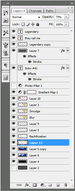
Proof (Forgot to save images, showing all my layers here):
D avy- Tier 3 (300 posts)
Re: ~*~ SOTW #42 ~*~ WINNERS ANNOUNCED
![]() by Relax. 17/6/2012, 7:15 pm
by Relax. 17/6/2012, 7:15 pm
For the ones that found the loophole: iPhone + 3G

Relax.- Tier 3 (300 posts)

LiamDOT- Tier 1 (Registered)
Re: ~*~ SOTW #42 ~*~ WINNERS ANNOUNCED
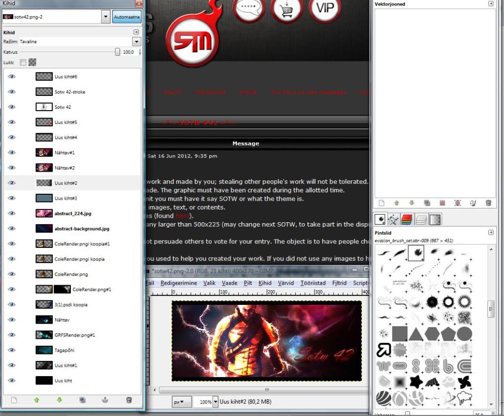
![]() by insidious 18/6/2012, 1:05 am
by insidious 18/6/2012, 1:05 am
And the proof:
https://2img.net/h/i1268.photobucket.com/albums/jj565/insidious01/400px-ShadowTheHedgehog-M1911A1.jpg
https://2img.net/h/i1268.photobucket.com/albums/jj565/insidious01/9ihzoft2.png
https://2img.net/h/i1268.photobucket.com/albums/jj565/insidious01/texture7.png
Last edited by insidious on 18/6/2012, 2:36 am; edited 1 time in total (Reason for editing : dimensions fix)
insidious- Tier 1 (Registered)
Re: ~*~ SOTW #42 ~*~ WINNERS ANNOUNCED
![]() by Grim IReaper 18/6/2012, 1:54 am
by Grim IReaper 18/6/2012, 1:54 am
Create New Layer > Image > Apply Image > Ctrl + U and hold the Shift key when shrinking your image. You may get a tiny amount of pixel loss, but a small entry is better than no entry at all.

Grim IReaper- Forum Addict (750 posts)
")
Re: ~*~ SOTW #42 ~*~ WINNERS ANNOUNCED
![]() by insidious 18/6/2012, 2:29 am
by insidious 18/6/2012, 2:29 am
will do
insidious- Tier 1 (Registered)
Re: ~*~ SOTW #42 ~*~ WINNERS ANNOUNCED
![]() by Stealth 18/6/2012, 5:26 am
by Stealth 18/6/2012, 5:26 am
Images Used: Short list
- Code:
http://i39.photobucket.com/albums/e176/Stealthy4u/halo_4_render_by_awakening_scarlet-d50bbpb.png
http://i39.photobucket.com/albums/e176/Stealthy4u/HaloCancelledGame.jpg

Stealth- Tier 2 (100 posts)
")
Re: ~*~ SOTW #42 ~*~ WINNERS ANNOUNCED
![]() by NGAF 18/6/2012, 6:17 am
by NGAF 18/6/2012, 6:17 am
NGAF- Tier 3 (300 posts)
Re: ~*~ SOTW #42 ~*~ WINNERS ANNOUNCED
![]() by Stealth 18/6/2012, 6:20 am
by Stealth 18/6/2012, 6:20 am
Stealth- Tier 2 (100 posts)
Re: ~*~ SOTW #42 ~*~ WINNERS ANNOUNCED
![]() by NGAF 18/6/2012, 6:59 am
by NGAF 18/6/2012, 6:59 am
Anyhow
My this week's entry:
Layers:
- Spoiler:
I am quite satisfied with the result
NGAF- Tier 3 (300 posts)
Re: ~*~ SOTW #42 ~*~ WINNERS ANNOUNCED
![]() by Kelly 18/6/2012, 7:36 am
by Kelly 18/6/2012, 7:36 am
Great entries, guys!
Kelly- Grandmaster (2000 posts)
Re: ~*~ SOTW #42 ~*~ WINNERS ANNOUNCED
![]() by Relax. 18/6/2012, 8:53 am
by Relax. 18/6/2012, 8:53 am
Proof: (internet didn't work, as said, so instead I entered the address of the graphics sub-forum. is this good enough for proof?
- Spoiler:


Last edited by Relax. on 23/6/2012, 7:20 am; edited 1 time in total
Relax.- Tier 3 (300 posts)
Re: ~*~ SOTW #42 ~*~ WINNERS ANNOUNCED
![]() by todgott 18/6/2012, 12:12 pm
by todgott 18/6/2012, 12:12 pm
NGAF wrote:...I am quite satisfied with the resultGot the focal done really nice, and color scheme is off the hook...
Sorry to disappoint you mate, but your focal is very Low Quality, squeezed and positioned in the worst places near powerpoints.. colors could be better aswell :?
Not going to talk about anything else in your signature...
(This is my personal opinion and i felt the need to share it as respectfully as i can)
P.S - Is it just me or are people getting more active during summer?
ENTRY:
- Code:
[img]http://i289.photobucket.com/albums/ll204/TodGott/ug.png[/img]
PROOF: [X]
Last edited by todgott on 20/6/2012, 2:30 am; edited 1 time in total

todgott- Tier 4 (500 posts)
")
Re: ~*~ SOTW #42 ~*~ WINNERS ANNOUNCED
![]() by D avy 18/6/2012, 12:43 pm
by D avy 18/6/2012, 12:43 pm
todgott wrote:P.S - Is it just me or are people getting more active during summer?
I'm having exams which means I photoshop in my spare time
D avy- Tier 3 (300 posts)
Re: ~*~ SOTW #42 ~*~ WINNERS ANNOUNCED
![]() by PRISM 18/6/2012, 7:54 pm
by PRISM 18/6/2012, 7:54 pm

PRISM- Forum Master (1500 posts)
")
Re: ~*~ SOTW #42 ~*~ WINNERS ANNOUNCED
![]() by Stealth 18/6/2012, 10:59 pm
by Stealth 18/6/2012, 10:59 pm
todgott wrote:P.S - Is it just me or are people getting more active during summer?
I graduated Saturday, so I'll be able to participate quite a bit more
Stealth- Tier 2 (100 posts)
Re: ~*~ SOTW #42 ~*~ WINNERS ANNOUNCED
![]() by PRISM 18/6/2012, 11:07 pm
by PRISM 18/6/2012, 11:07 pm
Stealth wrote:todgott wrote:P.S - Is it just me or are people getting more active during summer?
I graduated Saturday, so I'll be able to participate quite a bit more
Congratz! a rep is deserved
PRISM- Forum Master (1500 posts)
Page 1 of 3 • 1, 2, 3 ![]()
» ~*~ SOTW #32 ~*~ WINNERS ANNOUNCED!
» ~*~ SOTW #45 ~*~ WINNERS ANNOUNCED
» SOTW #20 - WINNERS ANNOUNCED
» ~*~ SOTW #33 ~*~ WINNERS ANNOUNCED
Index :: Social :: Graphics :: Graphics Archive
|
|
|