
 Latest images
Signature of the Week #75! Theme: Gambling! - WINNERS ANNOUNCED
5 posters
Index :: Social :: Graphics :: Graphics Archive
Page 1 of 1

Favourite signature?
Signature of the Week #75! Theme: Gambling! - WINNERS ANNOUNCED
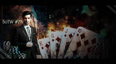
![]() by Inhaps 17/2/2014, 5:57 pm
by Inhaps 17/2/2014, 5:57 pm

Rules:
Your entry must be your own work; no stealing other people's work or entering in pre-made graphics
In the signature, please put SOTW or what the theme is for the text
No animated entries, explicit images, text, or contents
Please include the render/stock used or a screen shot of the image in the program you used. You do not have to put up both.
Sizes are not super strict, please just try not to exceed 500x350 (or if vertical 350x500).
When in voting, you may not persuade others to vote for your entry, or vote for your own.
Prizes:
1st place: 10M
2nd place: 8M
3rd place: 4M
Public favourite: 3M
Judging System
We will have 3+ judges who will vote on all entries, and there will be a poll once the thread is in voting so you can decide your winner and favourite!
This is what the judges will be looking at so make sure you know! Each Section will be for a total of 10 points 40 total.
- Spoiler:
*Idea
--Concept
--Composition
*Technical
--Flow
--Depth
--Lighting
*Typography
--Quality
--Integration
*Execution
--Balance
--Overall quality
Be inspired:

author: [x]
Entry Deadline: February 24, 2014
Entries:
FIRST PLACE and PUBLIC FAVOURITE: Mr Rockeye - 82.5/120
- Leakee's critique 25/40:
- Idea: 6/10 Has some form of gambling on there.
Technical: 7/10 Very good sig indeed
Typography: 5/10 I like it but it could be much better aesthetically and placement is off
Execution: 7/10 Try not to have HUGE black lines on both top and bottom, I don't like that at all.
- Kelly's critique 27/40:
- Idea: 7/10 - fits the theme of gambling.
Technical: 7.5/10 - quite like it in a sense, but does need a bit of polishing up in areas, it's overall quite dark, could use some adjustment layers, and maybe fix whatever kind of weird effect you put on the cards.
Typography: 6/10 - plain, and quite far away from your focal point in the sense that it's almost becoming an additional focus imo.
Execution: 6.5/10 - for your boarder (the giant black line above and below), avoid it being anything bigger than 2-3 pixels, unless you are working on a larger canvas, even then.. stick with a 1 px black boarder all around when in doubt. If it's too big, it can become distracting. Good entry!
- Inhaps' critique 30.5/40:
- Idea: 8/10
Technical: 7.5/10
Typography: 7.5/10 - The colour is good, though its placement and lighting on his face implies that he should cast a shadow on it.
Execution: 7.5/10 - Quite colourful but perhaps a bit too dark overall. It could have benefited from being slightly cropped from the right side as it is quite large and thus left with substantial whitespace.
SECOND PLACE: Stealth - 66.5/120
- Leakee's critique 20/40:
- Idea: 5/10 Never seen the film but this sig doesnt show gambling in the slightest
Technical: 5/10 The render(s) look squished
Typography: 5/10 Its your style however I would have done differently
Execution: 5/10
- Kelly's critique 21/40:
- Idea: 5/10 - includes gambling, but not the normal 'dice' and/or 'cards' approach, so for those who haven't seen Ocean's Eleven wouldn't really get the reference - probably would have been good to try to include another element associated with gambling to be doubly sure.
Technical: 4/10 - not your best work in my opinion; I think the overall piece is quite squished together, and the two toned color doesn't really look good. Lacks effects and details, too.
Typography: 7/10 - typography works, I would have placed it differently, but I like the way it looks, and does seem gambling-oriented.
Execution: 5/10 - good entry!
- Inhaps' critique 25.5/40:
- Idea: 7/10
Technical: 6/10
Typography: 6.5/10 - Nice and simple but definitely needs better contrast.
Execution: 6/10 - The main problem is the low quality of the stock image, which is not improved by being squished. If the background is lo-fi, then it might be best to keep the signature smaller rather than going for the max size. The white blot in the top left does little good to it; if the image were not stretched, then it might not have felt needed.
THIRD PLACE: feedpenguins - 55/120

- Leakee's critique 19/40:
- Idea: 7/10 fits the theme greatly.
Technical: 4/10, good for a learner, you are improving every week.
Typography: 3/10 it takes away from the sig, honestly.
Execution: 5/10
- Kelly's critique 18/40:
- Idea: 6/10 - fits the theme of gambling.
Technical: 4/10 - as Leakee said, you are improving weekly, keep it up you'll get the knack of it ^^
Typography: 4/10 - a bit of a tip with text, avoid it being extremely distracting and/or hard to read. Text, unless it is the focal of your piece, is supposed to be subtle and fit in with the rest of the piece.
Execution: 4/10 - good entry!
- Inhaps' critique 18/40:
- Idea: 7/10
Technical: 4/10 - The use of blur to draw attention to the dice works well.
Typography: 3/10 - It might look fine on larger text but as it is now it looks dirty.
Execution: 4/10 - It has some direction but it largely suffers from having the wild background that offers no contrast for the foreground. It all just blends together in a kind of mess.
Last edited by Inhaps on 2/3/2014, 6:24 pm; edited 3 times in total

Inhaps- Grandmaster (2000 posts)
")
Re: Signature of the Week #75! Theme: Gambling! - WINNERS ANNOUNCED
![]() by feedpenguins 20/2/2014, 2:31 am
by feedpenguins 20/2/2014, 2:31 am
EDITED: Changed text
- Spoiler:
Last edited by feedpenguins on 21/2/2014, 10:25 am; edited 1 time in total

feedpenguins- Tier 2 (100 posts)
")
Re: Signature of the Week #75! Theme: Gambling! - WINNERS ANNOUNCED
![]() by Stealth 20/2/2014, 4:12 am
by Stealth 20/2/2014, 4:12 am
Entry:
- Stock Photo:

Stealth- Tier 2 (100 posts)
Re: Signature of the Week #75! Theme: Gambling! - WINNERS ANNOUNCED
![]() by Leakee 20/2/2014, 6:50 am
by Leakee 20/2/2014, 6:50 am
Some epic sigs already! Good luck!
A massive, massive improvement, feedpenguins,
Welcome back Stealth!
A massive, massive improvement, feedpenguins,
Welcome back Stealth!

Leakee- Grandmaster (2000 posts)
-

Re: Signature of the Week #75! Theme: Gambling! - WINNERS ANNOUNCED
![]() by feedpenguins 20/2/2014, 6:54 am
by feedpenguins 20/2/2014, 6:54 am
Leakee wrote:Some epic sigs already! Good luck!
A massive, massive improvement, feedpenguins
thank you
feedpenguins- Tier 2 (100 posts)
Re: Signature of the Week #75! Theme: Gambling! - WINNERS ANNOUNCED
![]() by Stealth 20/2/2014, 7:46 am
by Stealth 20/2/2014, 7:46 am
Leakee wrote:Some epic sigs already! Good luck!
A massive, massive improvement, feedpenguins,
Welcome back Stealth!
Thanks Leakee! Glad to be back.
Stealth- Tier 2 (100 posts)
Re: Signature of the Week #75! Theme: Gambling! - WINNERS ANNOUNCED
![]() by Inhaps 20/2/2014, 2:19 pm
by Inhaps 20/2/2014, 2:19 pm
feedpenguins wrote:
- Spoiler:

It has some decent direction this time but it still needs some blending and better text.
__________________
Long time no see, Stealth.
Stealth wrote:Entry:
- Stock Photo:
Is it intended to be squished vertically?
Also, your post signature (not your entry) is much too large. Put some of it in a spoiler or a certain admin might get hissy.
Inhaps- Grandmaster (2000 posts)
Re: Signature of the Week #75! Theme: Gambling! - WINNERS ANNOUNCED
![]() by Stealth 20/2/2014, 5:34 pm
by Stealth 20/2/2014, 5:34 pm
Inhaps wrote:feedpenguins wrote:
- Spoiler:
It has some decent direction this time but it still needs some blending and better text.
__________________
Long time no see, Stealth.Stealth wrote:Entry:
- Stock Photo:
Is it intended to be squished vertically?
Also, your post signature (not your entry) is much too large. Put some of it in a spoiler or a certain admin might get hissy.
It's only slightly squished I'd say. The original cover isn't very good quality, so stretching out the pixels only makes it look worse, so by slightly squishing the photo, the overall quality is increased slightly. Also, I'll get to making my signature smaller.
Stealth- Tier 2 (100 posts)
Re: Signature of the Week #75! Theme: Gambling! - WINNERS ANNOUNCED
![]() by feedpenguins 21/2/2014, 2:21 am
by feedpenguins 21/2/2014, 2:21 am
Inhaps wrote:feedpenguins wrote:
- Spoiler:
It has some decent direction this time but it still needs some blending and better text.
i know the text is basic im still learning about text. sorry about that
feedpenguins- Tier 2 (100 posts)
Re: Signature of the Week #75! Theme: Gambling! - WINNERS ANNOUNCED
![]() by Stealth 21/2/2014, 3:45 am
by Stealth 21/2/2014, 3:45 am
feedpenguins wrote:Inhaps wrote:feedpenguins wrote:
- Spoiler:
It has some decent direction this time but it still needs some blending and better text.
i know the text is basic im still learning about text. sorry about that
Which program do you use to make your graphics Feedpenguins? If you use any version of Photoshop, I can help you with anything you want to get better at!
Stealth- Tier 2 (100 posts)
Re: Signature of the Week #75! Theme: Gambling! - WINNERS ANNOUNCED
![]() by feedpenguins 21/2/2014, 3:57 am
by feedpenguins 21/2/2014, 3:57 am
Stealth wrote:feedpenguins wrote:Inhaps wrote:feedpenguins wrote:
- Spoiler:
It has some decent direction this time but it still needs some blending and better text.
i know the text is basic im still learning about text. sorry about that
Which program do you use to make your graphics Feedpenguins? If you use any version of Photoshop, I can help you with anything you want to get better at!
im using photoshop CS6. ive only recently started using it so im just trying to learn everything pretty much. ive been going through different tutorials. if you have any links to good tutorials that would be a great help
feedpenguins- Tier 2 (100 posts)
Re: Signature of the Week #75! Theme: Gambling! - WINNERS ANNOUNCED
![]() by Mr Rockeye 23/2/2014, 9:50 am
by Mr Rockeye 23/2/2014, 9:50 am
Can i still enter?

Mr Rockeye- Tier 4 (500 posts)
")
Re: Signature of the Week #75! Theme: Gambling! - WINNERS ANNOUNCED
![]() by Leakee 23/2/2014, 1:52 pm
by Leakee 23/2/2014, 1:52 pm
Yes, I will be entering later today as well.
Leakee- Grandmaster (2000 posts)
-
Re: Signature of the Week #75! Theme: Gambling! - WINNERS ANNOUNCED
![]() by Mr Rockeye 23/2/2014, 9:01 pm
by Mr Rockeye 23/2/2014, 9:01 pm
My Entry:
Prove of ownership (I placed the layer set-up since I used loads of renders):
- Signature:
Prove of ownership (I placed the layer set-up since I used loads of renders):
- Prove:
Mr Rockeye- Tier 4 (500 posts)
Re: Signature of the Week #75! Theme: Gambling! - WINNERS ANNOUNCED
![]() by Stealth 1/3/2014, 11:15 pm
by Stealth 1/3/2014, 11:15 pm
When are these being completed?
Stealth- Tier 2 (100 posts)
Re: Signature of the Week #75! Theme: Gambling! - WINNERS ANNOUNCED
![]() by feedpenguins 2/3/2014, 12:03 am
by feedpenguins 2/3/2014, 12:03 am
Stealth wrote:When are these being completed?
I asked Inhaps yesterday and he told me by Monday
feedpenguins- Tier 2 (100 posts)
Re: Signature of the Week #75! Theme: Gambling! - WINNERS ANNOUNCED
![]() by Inhaps 2/3/2014, 3:48 pm
by Inhaps 2/3/2014, 3:48 pm
feedpenguins wrote:Stealth wrote:When are these being completed?
I asked Inhaps yesterday and he told me by Monday
I have made it a plan to release results on Sunday some 24 hours before the next SotW is out.
Inhaps- Grandmaster (2000 posts)
Sponsored content
» Signature of the Week #81! Theme: War! - WINNERS ANNOUNCED
» Signature of the Week #73! Theme: Pokémon! - WINNERS ANNOUNCED
» Signature of the Week #88! Theme: Supernatural - WINNERS ANNOUNCED
» Signature of the Week #76! Theme: Sports! - WINNERS ANNOUNCED
» Signature of the Week #89! Theme: Freestyle - WINNERS ANNOUNCED
» Signature of the Week #73! Theme: Pokémon! - WINNERS ANNOUNCED
» Signature of the Week #88! Theme: Supernatural - WINNERS ANNOUNCED
» Signature of the Week #76! Theme: Sports! - WINNERS ANNOUNCED
» Signature of the Week #89! Theme: Freestyle - WINNERS ANNOUNCED
Index :: Social :: Graphics :: Graphics Archive
Page 1 of 1
Permissions in this forum:
You cannot reply to topics in this forum|
|
|