
 Latest images
Signature of the Week #78! Theme: Television! - WINNERS ANNOUNCED
+3
feedpenguins
Arch Serene
Inhaps
7 posters
Index :: Social :: Graphics :: Graphics Archive
Page 1 of 1

Which is the best entry?
Signature of the Week #78! Theme: Television! - WINNERS ANNOUNCED
![]() by Inhaps 17/3/2014, 6:28 pm
by Inhaps 17/3/2014, 6:28 pm

Rules:
Your entry must be your own work; no stealing other people's work or entering in pre-made graphics
In the signature, please put SOTW or something related to the theme as the text
No animated entries, explicit images, text, or contents
Please include the render/stock used or a screen shot of the image in the program you used. You do not have to put up both.
Sizes are not super strict, please just try not to exceed 500x350 (or if vertical 350x500).
When in voting, you may not persuade others to vote for your entry, or vote for your own.
Prizes:
1st place: 10M
2nd place: 8M
3rd place: 4M
Public favourite: 3M
Judging System
We will have 3+ judges who will vote on all entries, and there will be a poll once the thread is in voting so you can decide your winner and favourite!
This is what the judges will be looking at so make sure you know! Each Section will be for a total of 10 points 40 total.
- Spoiler:
*Idea
--Concept
--Composition
*Technical
--Flow
--Depth
--Lighting
*Typography
--Quality
--Integration
*Execution
--Balance
--Overall quality
Be inspired:

author: [x]
Entry Deadline: March 24, 2014
FIRST PLACE and PUBLIC FAVOURITE: todgott - 82/120

- Inhaps' critique - 32:
- Idea: 8/10
Technical: 8/10 - House is either too sharpened or the gradient mask is what gives it low colour depth which makes the forehead seem to have a big blob of a single shade. The smudges on the right are too obvious and do not look great, unlike the ones on the left which do not have dark spots.
Typography: 8/10 - The lines of your name are too fine, becomes difficult to read thus; should have picked a better text AA option.
Execution: 8/10
- Kelly's critique - 27:
- Idea: 7/10
Technical: 6.5/10
Typography: 6.5/10
Execution: 7/10 - Simple concept, works well. The C4D's around House's head kind of look weird though.. But truthfully it sort of also fits because of who he is and his personality on the show, so a bit neutral about it :]
- Josh's critique - 23:
- Idea: 6/10
Technical: 6/10
Typography: 5/10
Execution: 6/10
Better than your last. Has good depth, and well placed c4ds. Text could use some work. Also white light on the top doesn't make sense to me.
SECOND PLACE: Mr Rockeye - 63/120

- Inhaps' critique - 27:
Idea: 8/10
Technical: 7/10 - lots of effects, though, I am not sure about the water droplets.
Typography: 5/10 - not a great choice of font and neither is it well blended. Something green-ish instead of a shadow would be better.
Execution: 7/10
- Kelly's critique - 26:
- Idea: 7/10
Technical: 6/10
Typography: 6/10
Execution: 7/10 - Great TV show (so great render choice ;D) looks pretty good, simple-ish but quite nice looking too :]!
- Josh's critique - 10:
- Idea: 3/10
Technical: 2/10
Typography: 2/10
Execution: 3/10
Really basic. Has a ton of effects that truly do not work with the render. Ask questions and look up tutorials.
THIRD PLACE: Leakee - 59.5/120

- Inhaps' critique - 24:
- Idea: 6/10
Technical: 6/10 - Looks like the image was given a massive contrast boost and then overlayed with a scratched pattern but that makes it look flat and washed-out.
Typography: 6/10 - Feels a tad too elaborate and there is an issue with kerning between A and G in DRAGONS. The rotated sotw does not work there very well, again, spacing is irregular. Adjust it manually for best results. The colours, however, are nice.
Execution: 6/10
- Kelly's critique - 22.5:
- Idea: 6/10
Technical: 6/10
Typography: 5/10
Execution: 5.5/10 - the text is unique, but i'd recommend moving it a bit closer to your focal point.
- Josh's critique - 13:
- Idea: 3/10
Technical: 3/10
Typography: 4/10
Execution: 3/10
Seems flat and very basic. Text is alright but a little too chaotic.
Arch Serene - 57.5/120

- Inhaps' critique - 23:
- Idea: 7/10 - Quite a literal take on the theme.
Technical: 6/10 - the render has a very noticeably pixelated outline, not blended at all.
Typography: 4/10 - sotw is blurry, strange outlines for the other text, lacks the oomph that a breaking news story needs.
Execution: 6/10
- Kelly's critique - 25.5:
- Idea: 7/10
Technical: 6/10
Typography: 6/10
Execution: 6.5/10 - simple in design and all, but worked well :]
- Josh's critique - 9:
- Idea: 3/10
Technical: 2/10
Typography: 2/10
Execution: 2/10
Idea is there. Just not executed. Everything is pixelated and not centered correctly. Look up tutorials.
feedpenguins - 33/120

- Inhaps' critique - 4:
- Idea: 1/10
Technical: 1/10
Typography: 1/10
Execution: 1/10 - terribly low-quality background; the signature should have been much smaller to make that fact much less noticeable. The type is quite illegible, not enough contrast between it and background
- Kelly's critique - 25:
- Idea: 5/10
Technical: 5/10
Typography: 5/10
Execution: 5/10 - The concept is good, but the text is very large and distracting.
- Josh's critique - 4:
- Idea: 1/10
Technical: 1/10
Typography: 1/10
Execution: 1/10
Just not a lot to it. Everything is blurry and basic. Needs depth. Its just a render on a (what looks like) a premade background.
Last edited by Inhaps on 2/4/2014, 3:37 pm; edited 2 times in total

Inhaps- Grandmaster (2000 posts)
")
Re: Signature of the Week #78! Theme: Television! - WINNERS ANNOUNCED
![]() by Arch Serene 20/3/2014, 10:16 pm
by Arch Serene 20/3/2014, 10:16 pm
I will try this,
I haven't used Photoshop since SOTW #51 so it shall be interesting :p
It was alot harder to think of an idea than i thought it would be.
(I hope Minions would count aha. It was on sky demand not too long ago so techinically it was on TV? )
I didn't want to push myself too hard for my first SOTW, so here you go :p
- Spoiler:


Arch Serene- Tier 4 (500 posts)
")
Re: Signature of the Week #78! Theme: Television! - WINNERS ANNOUNCED
![]() by feedpenguins 21/3/2014, 2:42 am
by feedpenguins 21/3/2014, 2:42 am
My entry
Render used
Render used
- Spoiler:

Last edited by feedpenguins on 23/3/2014, 1:06 pm; edited 1 time in total

feedpenguins- Tier 2 (100 posts)
")
Re: Signature of the Week #78! Theme: Television! - WINNERS ANNOUNCED
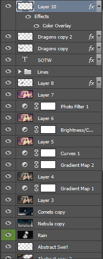
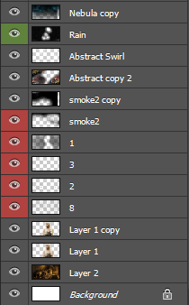
![]() by Leakee 23/3/2014, 1:04 pm
by Leakee 23/3/2014, 1:04 pm
- Spoiler:

Leakee- Grandmaster (2000 posts)
-

Re: Signature of the Week #78! Theme: Television! - WINNERS ANNOUNCED
![]() by todgott 23/3/2014, 4:50 pm
by todgott 23/3/2014, 4:50 pm
- proof:


todgott- Tier 4 (500 posts)
Re: Signature of the Week #78! Theme: Television! - WINNERS ANNOUNCED
![]() by Mr Rockeye 23/3/2014, 8:18 pm
by Mr Rockeye 23/3/2014, 8:18 pm
My entry:
- Proof:


Mr Rockeye- Tier 4 (500 posts)
Re: Signature of the Week #78! Theme: Television! - WINNERS ANNOUNCED
![]() by Josh Designs 2/4/2014, 2:00 am
by Josh Designs 2/4/2014, 2:00 am
You guys know you can talk and discuss sotw sigs in these threads right? Do not be afraid to ask for advice or critiques.
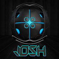
Josh Designs- Forum Addict (750 posts)
")
Sponsored content
» Signature of the Week #81! Theme: War! - WINNERS ANNOUNCED
» Signature of the Week #76! Theme: Sports! - WINNERS ANNOUNCED
» Signature of the Week #89! Theme: Freestyle - WINNERS ANNOUNCED
» Signature of the Week #77! Theme: Music! - WINNERS ANNOUNCED
» Signature of the Week #90! Theme: Holidays! - WINNERS ANNOUNCED
» Signature of the Week #76! Theme: Sports! - WINNERS ANNOUNCED
» Signature of the Week #89! Theme: Freestyle - WINNERS ANNOUNCED
» Signature of the Week #77! Theme: Music! - WINNERS ANNOUNCED
» Signature of the Week #90! Theme: Holidays! - WINNERS ANNOUNCED
Index :: Social :: Graphics :: Graphics Archive
Page 1 of 1
Permissions in this forum:
You cannot reply to topics in this forum|
|
|