
 Latest images
Signature of the Week #90! Theme: Holidays! - WINNERS ANNOUNCED
+2
Mr Rockeye
Inhaps
6 posters
Index :: Social :: Graphics :: Graphics Archive
Page 1 of 1

Which is your favourite signature?
Signature of the Week #90! Theme: Holidays! - WINNERS ANNOUNCED
![]() by Inhaps 23/6/2014, 6:41 pm
by Inhaps 23/6/2014, 6:41 pm

Rules:
Your entry must be your own work; no stealing other people's work or entering in pre-made graphics
In the signature, please have your name or something related to the theme as the text
No animated entries, explicit images, text, or contents
Please include the render/stock used or a screen shot of the image in the program you used. You do not have to put up both.
Sizes are not super strict, please just try not to exceed 500x350 (or if vertical 350x500).
When in voting, you may not persuade others to vote for your entry, or vote for your own.
Prizes:
1st place: 10M
2nd place: 8M
3rd place: 4m
Public favourite: 3M
Judging System
We will have judges who will vote on all entries, and there will be a poll once the thread is in voting so you can decide your winner and favourite!
This is what the judges will be looking at so make sure you know! Each Section will be for a total of 10 points 40 total.
- Spoiler:
*Idea
--Concept
--Composition
*Technical
--Flow
--Depth
--Lighting
*Typography
--Quality
--Integration
*Execution
--Balance
--Overall quality
Entry Deadline: July 7, 2014
FIRST PLACE and PUBLIC FAVOURITE: Begone13 - 58.5/80

- Inhaps' critique - 30:
- Idea: 10/10
Technical: 7/10 - Good flow. Good overall colour contrast but it is somewhat lacking in detail.
Typography: 6/10 - The colours and placement are good but I am not so sure about the font; also, it all has aliasing artifacts.
Execution: 7/10
- Kelly's critique - 28.5:
- Idea: 10/10
Technical: 5.5/10
Typography: 6/10
Execution: 7/10
SECOND PLACE: stitch - 53.5/80

- Inhaps' critique - 26:
- Idea: 8/10
Technical: 5/10 - The render is too much like the background and I cannot necessarily tell where it ends which just looks odd with such relatively small render. It also does not feel like there is any flow to it.
Typography: 7/10 - Good by itself but not quite the right choice of colours over that background.
Execution: 6/10 - Really ought to have more colour to it. It all blends together too much.
- Kelly's critique - 27.5:
- Idea: 9/10
Technical: 6/10
Typography: 5.5/10
Execution: 7/10
THIRD PLACE: Mr Rockeye - 51.5/80

- Inhaps' critique - 25:
- Idea: 9/10
Technical: 5/10 - All the colour adjustments create the appearance of low colour depth which really should be avoided since it just causes massive blots of a single colour like on the rabbit's cheek. Overall the colours just look weird, probably due to not having enough midtones.
Typography: 5/10 - Looks very generic and does not fit in with the overall theme of the piece.
Execution: 6/10
- Kelly's critique - 26.5:
- Idea: 10/10
Technical: 5/10
Typography: 5/10
Execution: 6.5/10
Last edited by Inhaps on 14/7/2014, 6:45 pm; edited 4 times in total

Inhaps- Grandmaster (2000 posts)
")
Re: Signature of the Week #90! Theme: Holidays! - WINNERS ANNOUNCED
![]() by Mr Rockeye 29/6/2014, 7:56 pm
by Mr Rockeye 29/6/2014, 7:56 pm
I'm not quite sure if I can make it in time, if I do make it in time my submission will be tomorrow.
Good luck guys!
Good luck guys!

Mr Rockeye- Tier 4 (500 posts)
")
Re: Signature of the Week #90! Theme: Holidays! - WINNERS ANNOUNCED
![]() by Stitch 30/6/2014, 10:31 am
by Stitch 30/6/2014, 10:31 am
Not been a good week for graphics it seems lol. It sucks I don't have enough time to do it all 

Stitch- Tier 4 (500 posts)
-

Re: Signature of the Week #90! Theme: Holidays! - WINNERS ANNOUNCED
![]() by Inhaps 30/6/2014, 2:44 pm
by Inhaps 30/6/2014, 2:44 pm
Well, I am having my graduation party today, tomorrow and the day after tomorrow so we might just assume that this is extended for another week.
Inhaps- Grandmaster (2000 posts)
Re: Signature of the Week #90! Theme: Holidays! - WINNERS ANNOUNCED
![]() by Mr Rockeye 30/6/2014, 7:58 pm
by Mr Rockeye 30/6/2014, 7:58 pm
Sounds good to me than I'll have more time to finish my work 
Mr Rockeye- Tier 4 (500 posts)
Re: Signature of the Week #90! Theme: Holidays! - WINNERS ANNOUNCED
![]() by Stitch 5/7/2014, 6:45 pm
by Stitch 5/7/2014, 6:45 pm
My entry if it still counts:
EDIT: She is wearing a santa outfit, before you ask, the holiday is christmas.
- Proof:

EDIT: She is wearing a santa outfit, before you ask, the holiday is christmas.
Stitch- Tier 4 (500 posts)
-
Re: Signature of the Week #90! Theme: Holidays! - WINNERS ANNOUNCED
![]() by Mr Rockeye 7/7/2014, 12:12 pm
by Mr Rockeye 7/7/2014, 12:12 pm
I really hate my entry this week didn't get enough inspiration for the theme this time.
But ah well here it is.
My entry:
But ah well here it is.
My entry:
- proof:

Mr Rockeye- Tier 4 (500 posts)
Re: Signature of the Week #90! Theme: Holidays! - WINNERS ANNOUNCED
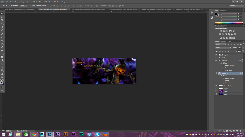
![]() by Begone13 7/7/2014, 6:46 pm
by Begone13 7/7/2014, 6:46 pm
If you cant tell its halloween
- Spoiler:

Begone13- Forum Master (1500 posts)
")
Re: Signature of the Week #90! Theme: Holidays! - WINNERS ANNOUNCED
![]() by Kelly 7/7/2014, 8:51 pm
by Kelly 7/7/2014, 8:51 pm
Begone13 wrote:
If you cant tell its halloween
- Spoiler:
Oh, and here I thought it was for New Years
 .
.

Kelly- Grandmaster (2000 posts)
Re: Signature of the Week #90! Theme: Holidays! - WINNERS ANNOUNCED
![]() by Begone13 7/7/2014, 9:57 pm
by Begone13 7/7/2014, 9:57 pm
Kelly wrote:Begone13 wrote:
If you cant tell its halloween
- Spoiler:
Oh, and here I thought it was for New Years
you got me kelly this was one elaborate scheme to make people think it was for halloween when in reality its for new years so while everyone was distracted i was seceretly behind the curtain doing lots of mischief and shenanigans
Begone13- Forum Master (1500 posts)
Re: Signature of the Week #90! Theme: Holidays! - WINNERS ANNOUNCED
![]() by piramatrix 12/7/2014, 11:39 am
by piramatrix 12/7/2014, 11:39 am
voted

piramatrix- Forum Master (1500 posts)
Sponsored content
» Signature of the Week #81! Theme: War! - WINNERS ANNOUNCED
» Signature of the Week #77! Theme: Music! - WINNERS ANNOUNCED
» Signature of the Week #78! Theme: Television! - WINNERS ANNOUNCED
» Signature of the Week #79! Theme: Space! - WINNERS ANNOUNCED
» Signature of the Week #91! Theme: Seaside - WINNERS ANNOUNCED
» Signature of the Week #77! Theme: Music! - WINNERS ANNOUNCED
» Signature of the Week #78! Theme: Television! - WINNERS ANNOUNCED
» Signature of the Week #79! Theme: Space! - WINNERS ANNOUNCED
» Signature of the Week #91! Theme: Seaside - WINNERS ANNOUNCED
Index :: Social :: Graphics :: Graphics Archive
Page 1 of 1
Permissions in this forum:
You cannot reply to topics in this forum|
|
|