
 Latest images
Signature of the Week #79! Theme: Space! - WINNERS ANNOUNCED
+4
Stealth
Arch Serene
Kelly
Inhaps
8 posters
Index :: Social :: Graphics :: Graphics Archive
Page 1 of 1

Which is the best entry?
Signature of the Week #79! Theme: Space! - WINNERS ANNOUNCED
![]() by Inhaps 24/3/2014, 6:14 pm
by Inhaps 24/3/2014, 6:14 pm

Rules:
Your entry must be your own work; no stealing other people's work or entering in pre-made graphics
In the signature, please put SOTW or something related to the theme as the text
No animated entries, explicit images, text, or contents
Please include the render/stock used or a screen shot of the image in the program you used. You do not have to put up both.
Sizes are not super strict, please just try not to exceed 500x350 (or if vertical 350x500).
When in voting, you may not persuade others to vote for your entry, or vote for your own.
Prizes:
1st place: 10M
2nd place: 8M
3rd place: 4M
Public favourite: 3M
Judging System
We will have 3+ judges who will vote on all entries, and there will be a poll once the thread is in voting so you can decide your winner and favourite!
This is what the judges will be looking at so make sure you know! Each Section will be for a total of 10 points 40 total.
- Spoiler:
*Idea
--Concept
--Composition
*Technical
--Flow
--Depth
--Lighting
*Typography
--Quality
--Integration
*Execution
--Balance
--Overall quality
Be inspired:

author: [x]
Entry Deadline: March 31, 2014
FIRST PLACE and PUBLIC FAVOURITE: Stealth - 57/80

- Leakee's critique - 26:
- Idea: 9/10
Technical: 7/10
Typography: 4/10
Execution: 6/10 Text is a bit off putting, better placement/colour would be better, imo.
- Inhaps' critique - 31:
- Idea: 7/10
Technical: 8/10
Typography: 8/10
Execution: 8/10 - Pretty and all but the lights do not make a whole lot of sense.
SECOND PLACE: Josh Designs - 50/80

- Leakee's critique - 18:
- Idea: 6/10
Technical: 4/10
Typography: 4/10
Execution: 4/10 There is a lot of empty space and this signature leaves a lot to be desired, I feel a smaller width would have done the trick.
- Inhaps' critique - 32:
- Idea: 8/10
Technical: 9/10
Typography: 7/10 - Kerning feels a bit of in DEAD SPACE and the text looks too small overall.
Execution: 8/10 - It feels too wide, sort of like it has a lot of dead space.
THIRD PLACE: Kelly - 48.5/80

- Leakee's critique - 21.5:
- Idea: 5/10
Technical: 7/10
Typography: 3.5/10
Execution: 6/10 His right leg is quite the hinderance once is it noticed, similarly to Josh's entry I believe it is too big length and width-wise, a sense of emptiness comes to mind on the left side.
- Inhaps' critique - 27:
- Idea: 7/10
Technical: 7/10
Typography: 6/10
Execution: 7/10 - Generally lacks good contrast; it is either really dark or really bright, thus losing a lot of detail in between.
Last edited by Inhaps on 7/4/2014, 8:03 pm; edited 4 times in total

Inhaps- Grandmaster (2000 posts)
")
Re: Signature of the Week #79! Theme: Space! - WINNERS ANNOUNCED
![]() by Kelly 24/3/2014, 6:30 pm
by Kelly 24/3/2014, 6:30 pm
Awesome theme. I'll see if I can try to muster something up later this week if I get any free time  .
.

Kelly- Grandmaster (2000 posts)
Re: Signature of the Week #79! Theme: Space! - WINNERS ANNOUNCED
![]() by Arch Serene 24/3/2014, 8:55 pm
by Arch Serene 24/3/2014, 8:55 pm
I love the designs people can create with this theme. I will try my best with this!!
[picture will be inserted here:p]
[picture will be inserted here:p]

Arch Serene- Tier 4 (500 posts)
")
Re: Signature of the Week #79! Theme: Space! - WINNERS ANNOUNCED
![]() by Stealth 25/3/2014, 12:41 am
by Stealth 25/3/2014, 12:41 am
My Entry:
- Proof:

Stealth- Tier 2 (100 posts)
")
Re: Signature of the Week #79! Theme: Space! - WINNERS ANNOUNCED
![]() by Josh Designs 25/3/2014, 9:46 pm
by Josh Designs 25/3/2014, 9:46 pm
Figured I would do something for this theme.

Josh Designs- Forum Addict (750 posts)
")
Re: Signature of the Week #79! Theme: Space! - WINNERS ANNOUNCED
![]() by Stealth 27/3/2014, 5:46 am
by Stealth 27/3/2014, 5:46 am
Josh Designs wrote:
Figured I would do something for this theme.
Aye, could you link me to the renders of the asteroids you used in this piece?
Stealth- Tier 2 (100 posts)
Re: Signature of the Week #79! Theme: Space! - WINNERS ANNOUNCED
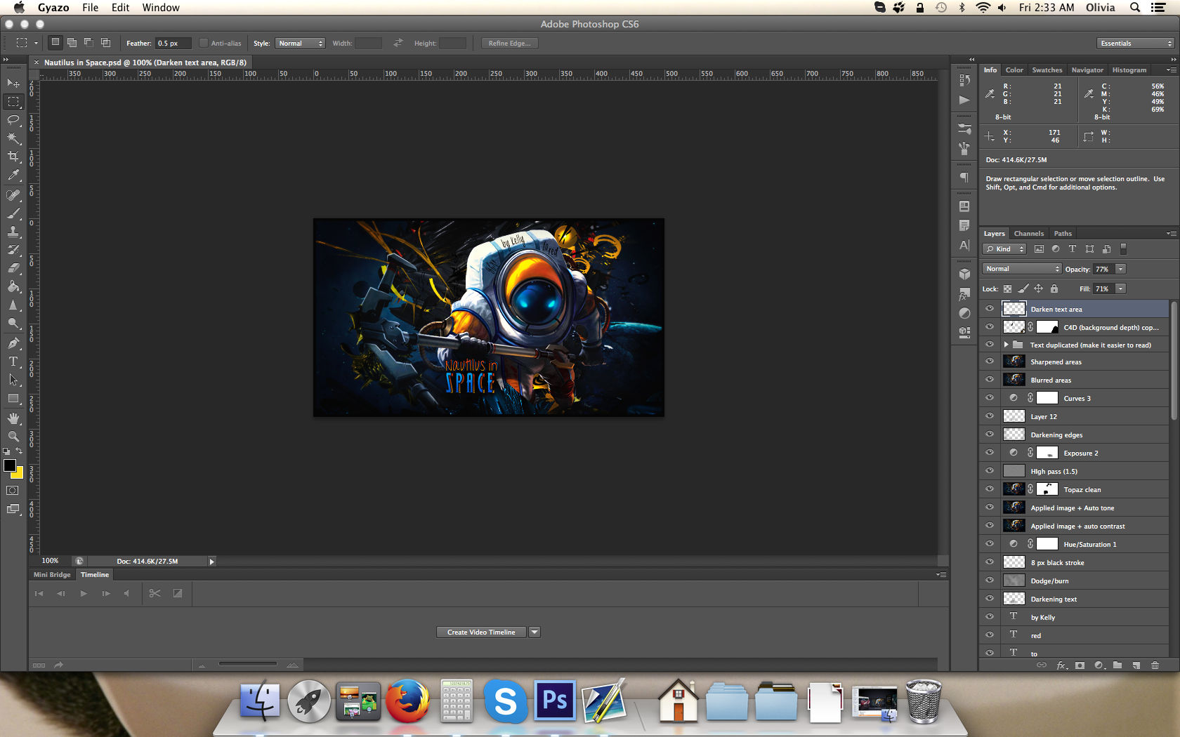
![]() by Kelly 28/3/2014, 6:34 am
by Kelly 28/3/2014, 6:34 am
I made time to make an entry this week =]
- PROOF:
Kelly- Grandmaster (2000 posts)
Re: Signature of the Week #79! Theme: Space! - WINNERS ANNOUNCED
![]() by Inhaps 28/3/2014, 10:55 am
by Inhaps 28/3/2014, 10:55 am
Nice entries so far. Good luck for all.
Inhaps- Grandmaster (2000 posts)
Re: Signature of the Week #79! Theme: Space! - WINNERS ANNOUNCED
![]() by Josh Designs 2/4/2014, 2:02 am
by Josh Designs 2/4/2014, 2:02 am
Kelly wrote:I made time to make an entry this week =]
- PROOF:
Hey, is his right leg supposed to be cut off like that? Btw sig looks good.
Josh Designs- Forum Addict (750 posts)
Re: Signature of the Week #79! Theme: Space! - WINNERS ANNOUNCED
![]() by Leakee 2/4/2014, 8:05 am
by Leakee 2/4/2014, 8:05 am
Josh Designs wrote:Kelly wrote:I made time to make an entry this week =]
- PROOF:
Hey, is his right leg supposed to be cut off like that? Btw sig looks good.
I noticed the same thing, amazing signature though

Leakee- Grandmaster (2000 posts)
-

Re: Signature of the Week #79! Theme: Space! - WINNERS ANNOUNCED
![]() by Kelly 2/4/2014, 8:24 pm
by Kelly 2/4/2014, 8:24 pm
Leakee wrote:Josh Designs wrote:Kelly wrote:I made time to make an entry this week =]
- PROOF:
Hey, is his right leg supposed to be cut off like that? Btw sig looks good.
I noticed the same thing, amazing signature though
I think you mean the left leg the way he's facing? Yeah, it's meant to create a bit of foreground depth, but I really should have tinkered with it some more in the general area to make it look a bit better and less like it was just abruptly cut off XD
Kelly- Grandmaster (2000 posts)
Re: Signature of the Week #79! Theme: Space! - WINNERS ANNOUNCED
![]() by Huluplus 2/4/2014, 8:57 pm
by Huluplus 2/4/2014, 8:57 pm
Voted for Kelly although I liked the 3 entries, when I think of a signature I think more a wider graphic fits better. This is just my personal preference and opinion.

Huluplus- Grandmaster (2000 posts)
Re: Signature of the Week #79! Theme: Space! - WINNERS ANNOUNCED
![]() by eater 5/4/2014, 3:36 pm
by eater 5/4/2014, 3:36 pm
DID I SERIOUSLY JUST MISS THIS?!
I like Stealth's though, nice job!
All great entries, all great.
I like Stealth's though, nice job!
All great entries, all great.

eater- Tier 3 (300 posts)
")
Re: Signature of the Week #79! Theme: Space! - WINNERS ANNOUNCED
![]() by Kelly 5/4/2014, 4:42 pm
by Kelly 5/4/2014, 4:42 pm
eater wrote:DID I SERIOUSLY JUST MISS THIS?!
Lmfao! I was shocked when you didn't make an entry, honestly
Kelly- Grandmaster (2000 posts)
Sponsored content
» Signature of the Week #81! Theme: War! - WINNERS ANNOUNCED
» Signature of the Week #75! Theme: Gambling! - WINNERS ANNOUNCED
» Signature of the Week #76! Theme: Sports! - WINNERS ANNOUNCED
» Signature of the Week #88! Theme: Supernatural - WINNERS ANNOUNCED
» Signature of the Week #77! Theme: Music! - WINNERS ANNOUNCED
» Signature of the Week #75! Theme: Gambling! - WINNERS ANNOUNCED
» Signature of the Week #76! Theme: Sports! - WINNERS ANNOUNCED
» Signature of the Week #88! Theme: Supernatural - WINNERS ANNOUNCED
» Signature of the Week #77! Theme: Music! - WINNERS ANNOUNCED
Index :: Social :: Graphics :: Graphics Archive
Page 1 of 1
Permissions in this forum:
You cannot reply to topics in this forum|
|
|