Artistic Blur CnC Pit
+13
Magic
cntr
Tuff Tiga
DoYouPlay_RS
Kelly
todgott
Aezure
PredatorGFX
Broeder
helloim96
Josh Designs
Kitty Alex
Atlas
17 posters
Page 3 of 7 •  1, 2, 3, 4, 5, 6, 7
 Re: Artistic Blur CnC Pit
And don't ignore typography man. The sooner you start looking into nice typography the better you will get. That goes to everyone! WORK ON YOUR TYPE!!!

Josh Designs- Forum Addict (750 posts)

 Re: Artistic Blur CnC Pit
And you dont have to +rep me every post  , make me work for them e-penis inches

Broeder- Grandmaster (2000 posts)

 Re: Artistic Blur CnC Pit
Josh Designs wrote:And don't ignore typography man. The sooner you start looking into nice typography the better you will get. That goes to everyone! WORK ON YOUR TYPE!!!
^
He has a very good point. The art of text and the art of tagmaking, while are different, are both equally important. The text can make or break your tag, but so can flaws within the tag. If that makes sense, lol

Kelly- Grandmaster (2000 posts)

 Re: Artistic Blur CnC Pit
DoYouPlay_RS wrote:
Not bad. Parts of this sig a wayy over sharpened. Its good that you tried something new with the type but its just not working for me. And i think the gradient map you have on this is just a little to strong.

Josh Designs- Forum Addict (750 posts)

 Re: Artistic Blur CnC Pit
These are both gifts to people on a different forum, but tried new things with both.


Last edited by Kelly on 15/1/2013, 3:50 am; edited 1 time in total

Kelly- Grandmaster (2000 posts)

 Re: Artistic Blur CnC Pit
Kelly-
Typography needs work in both tbh. I would add darks in both aswell. And for your type its to close to the sides on both of them. Use darks to help bring out lights. I see you doing the stock background things which is nice. I agree with the stock you chose with the bottom one but the spiderman one just seems off. But overal i like the bottom one more.
Typography needs work in both tbh. I would add darks in both aswell. And for your type its to close to the sides on both of them. Use darks to help bring out lights. I see you doing the stock background things which is nice. I agree with the stock you chose with the bottom one but the spiderman one just seems off. But overal i like the bottom one more.

Josh Designs- Forum Addict (750 posts)

 Re: Artistic Blur CnC Pit
Josh, thanks for the feedback. Yeah, text is something I have to get back into. I'm still not fully used to the subtle changes between using Mac and PC. Not all of my beloved fonts are on this Mac, yet. Cheers for the feedback
For you & Tuff's collab, the render's face looks over sharpened (not much, just a bit). The purple glow/blur parts look a bit too strong, taking the focus away from the Venom render's face. Nice text usage, but I would recommend moving it closer to the render, as it being too far away it becomes a second focal, similar to the blur/glow. However, if the text is moved, the left-side then becomes a bit bare. Overall I do like it
For you & Tuff's collab, the render's face looks over sharpened (not much, just a bit). The purple glow/blur parts look a bit too strong, taking the focus away from the Venom render's face. Nice text usage, but I would recommend moving it closer to the render, as it being too far away it becomes a second focal, similar to the blur/glow. However, if the text is moved, the left-side then becomes a bit bare. Overall I do like it

Kelly- Grandmaster (2000 posts)

 Re: Artistic Blur CnC Pit
id say thats not bad for a first c4d sig tuff tiga but the text could use some work, it stands out more than the render which kindof turns it into a main focal, Also try to make sure that when u put c4ds to a smaller size u dont lose to much quality as the ones in the back near his right shoulder look very low quality and pixely. The background could be blured a bit to add some more depth and i think the lighting ontop of his shoulders and head doesnt really work. It makes that area was less popping out i guess and points the focus toward his arms

cntr- Tier 2 (100 posts)

 Re: Artistic Blur CnC Pit
One more gift to someone of another board. Thanking her for the render share. I made a colored and b&w version. Tried a few new effects and a different background than I usually tend to go with.
Tried to fix up the text a bit, too. It's a bit too far away from the render, that's for sure, but more interested in it being better versus placement


Tried to fix up the text a bit, too. It's a bit too far away from the render, that's for sure, but more interested in it being better versus placement


Kelly- Grandmaster (2000 posts)

 Re: Artistic Blur CnC Pit
Kelly wrote:One more gift to someone of another board. Thanking her for the render share. I made a colored and b&w version. Tried a few new effects and a different background than I usually tend to go with.
Tried to fix up the text a bit, too. It's a bit too far away from the render, that's for sure, but more interested in it being better versus placement
The Blue C4D on the right is cut off, it looks like it's the edge of the render?

Magic- Tier 1 (Registered)

 Re: Artistic Blur CnC Pit
Once again, the overintensity of colors ruins the sig :/
Also, I would preffer some bluring round lower edges and/or background
Also, I would preffer some bluring round lower edges and/or background

todgott- Tier 4 (500 posts)

 Re: Artistic Blur CnC Pit
The colors would have been fine if the green was more of an eye catcher, now the 2 balls in his hands(which make no sense at all) overpower the render as focal points. Could use better depth as well

Broeder- Grandmaster (2000 posts)

 Re: Artistic Blur CnC Pit
Broeder wrote:The colors would have been fine if the green was more of an eye catcher, now the 2 balls in his hands(which make no sense at all) overpower the render as focal points. Could use better depth as well
Sigs dont need to make sense!!! haha i can be creative in my own way thats why i do this! you nut.

Josh Designs- Forum Addict (750 posts)

 Re: Artistic Blur CnC Pit
Art is whatever you want it to be...Josh Designs wrote:Broeder wrote:The colors would have been fine if the green was more of an eye catcher, now the 2 balls in his hands(which make no sense at all) overpower the render as focal points. Could use better depth as well
Sigs dont need to make sense!!! haha i can be creative in my own way thats why i do this! you nut.
Atlas- Tier 4 (500 posts)

 Re: Artistic Blur CnC Pit
Im stating it doesnt make sense, not that it should.
But it helps, when was the last time the Hulk threw energy balls?
But it helps, when was the last time the Hulk threw energy balls?

Broeder- Grandmaster (2000 posts)

 Re: Artistic Blur CnC Pit
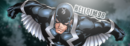
helloim96 wrote:
Better, but you really should lay off the grunge fonts. I'd suggest going to YouTube or deviantART and following some guides.

PredatorGFX- Tier 2 (100 posts)

 Re: Artistic Blur CnC Pit
Broeder wrote:Im stating it doesnt make sense, not that it should.
But it helps, when was the last time the Hulk threw energy balls?
He gets possessed a lot and takes on new powers sometimes.
http://hulkcollection.files.wordpress.com/2007/12/hulk-stuff-5-191.jpg
red hulk
http://images1.wikia.nocookie.net/__cb20091225033534/marveldatabase/images/5/5a/Hulk_Vol_2_12_page_13_Red_Hulk_(Earth-616).jpg

Josh Designs- Forum Addict (750 posts)

 Re: Artistic Blur CnC Pit
Not bad DYPR, I wanna know why people use that font it is absolutely terrible. The kerning is too tight on it as well. I would have maybe darkened the sides of the sigs too.

Josh Designs- Forum Addict (750 posts)

Page 3 of 7 •  1, 2, 3, 4, 5, 6, 7
Permissions in this forum:
You cannot reply to topics in this forum|
|
|

 Home
Home


