
 Latest images
CnC Pit
+17
todgott
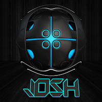
Josh Designs
Kelly
Mark
PoPoTaTo
Daxaal
Magic
DoYouPlay_RS
Leakee
Tuff Tiga
Aezure
Jiggie
Simaas
PRISM
Inhaps
PredatorGFX
Broeder
21 posters
Page 5 of 5 •  1, 2, 3, 4, 5


PRISM- Forum Master (1500 posts)
")
Josh Designs- Forum Addict (750 posts)
")

DoYouPlay_RS- Grandmaster (2000 posts)
")
-

Josh Designs- Forum Addict (750 posts)
Re: CnC Pit
![]() by 17marine23 11/5/2013, 10:10 pm
by 17marine23 11/5/2013, 10:10 pm

Just whipped this baby up, i like using minimal effects.
17marine23- Tier 1 (Registered)
")

Re: CnC Pit
![]() by DoYouPlay_RS 4/9/2013, 2:20 am
by DoYouPlay_RS 4/9/2013, 2:20 am
WukongJosh Designs wrote:Kinda old but meh
Not really much I have to say other than amazing ._.
DoYouPlay_RS- Grandmaster (2000 posts)
-
Re: CnC Pit
![]() by Kelly 3/12/2013, 3:14 am
by Kelly 3/12/2013, 3:14 am
I'll utilize the opportunity to try to get some constructive feedback and liven this thread up a bit...

This was a gift to a friend, and is very outside my normal style, but follows a dear friend of mine's style using various pieces of renders to help create the piece.
This was a gift to a friend, and is very outside my normal style, but follows a dear friend of mine's style using various pieces of renders to help create the piece.

Kelly- Grandmaster (2000 posts)
Re: CnC Pit
![]() by Josh Designs 8/1/2014, 6:49 pm
by Josh Designs 8/1/2014, 6:49 pm
Ill give some feedback a month late. Overall i really think its a nice piece. i think think the text could have been better. Or could have not been incorporated since it is such a small tag. I would have also maybe put an orange lens flare on the right side of his hood right above his eye to help with the atmosphere. Other then that nice work.
Josh Designs- Forum Addict (750 posts)
Re: CnC Pit
![]() by Kelly 10/1/2014, 9:47 pm
by Kelly 10/1/2014, 9:47 pm
Josh Designs wrote:Ill give some feedback a month late. Overall i really think its a nice piece. i think think the text could have been better. Or could have not been incorporated since it is such a small tag. I would have also maybe put an orange lens flare on the right side of his hood right above his eye to help with the atmosphere. Other then that nice work.
Hey, thanks for the feedback. I completely agree on the text. I was not going to put any on at first, but then in the end somehow ended up adding it. Not as well executed as I hoped. An orange lens flare would have really have looked nice; I'll give that a shot sometime, see how it looks ^^. Thank you for the input!
Kelly- Grandmaster (2000 posts)
Re: CnC Pit
![]() by Aezure 3/3/2014, 2:50 pm
by Aezure 3/3/2014, 2:50 pm
So I've been fairly bored in lectures a bit recently so I've been booting up Photoshop...


Aezure- Forum Fanatic (1000 posts)
-

Re: CnC Pit
![]() by Inhaps 6/5/2014, 7:30 pm
by Inhaps 6/5/2014, 7:30 pm
DoYouPlay_RS wrote:
The only thing I would suggest is to make the dark parts darker for better contrast.

Inhaps- Grandmaster (2000 posts)
Re: CnC Pit
![]() by Mr Rockeye 30/5/2014, 3:05 pm
by Mr Rockeye 30/5/2014, 3:05 pm
Here are some other pieces I've made, I've been trying to get a new work style with more smoothness in it.
#1 : The Elderscroll
It might be a bit big tho...

#2 : The Campfire
This was all handmade on my GFX tablet.

#3 : Captain America


Mr Rockeye- Tier 4 (500 posts)
")
Re: CnC Pit
![]() by Kelly 5/6/2014, 2:52 am
by Kelly 5/6/2014, 2:52 am
Can I get some C&C to a new piece I just made? Slowly working on my smudging skills, will branch into a new type of smudge stroke soon hopefully  ...
...

Also Mr Rockeye I'm a bit late to reply with my C&C but here it goes:
1st one–
Feels like your focal point and the background are disconnected. The smudge is a good try, but because it doesn’t blend or even really fit with the background it looks awkward. The light looks forced. The smokey affect is cool, but it feels odd to have random smoke against a black and red background :p…
2nd–
Not bad. I like the concept, and the smudging looks pretty good. Add some more “wow” to it, and work on the text some.
3rd one–
The text is a bit hard to read, work on that some. Lighting looks a little forced, but not overly so, nice touch. Just like with the 2nd one, add a bit of “wow” to it
Kelly- Grandmaster (2000 posts)
Re: CnC Pit
![]() by GiovanniM 5/6/2014, 6:27 am
by GiovanniM 5/6/2014, 6:27 am
Kelly wrote:Can I get some C&C to a new piece I just made? Slowly working on my smudging skills, will branch into a new type of smudge stroke soon hopefully
Also Mr Rockeye I'm a bit late to reply with my C&C but here it goes:
1st one–
Feels like your focal point and the background are disconnected. The smudge is a good try, but because it doesn’t blend or even really fit with the background it looks awkward. The light looks forced. The smokey affect is cool, but it feels odd to have random smoke against a black and red background :p…
2nd–
Not bad. I like the concept, and the smudging looks pretty good. Add some more “wow” to it, and work on the text some.
3rd one–
The text is a bit hard to read, work on that some. Lighting looks a little forced, but not overly so, nice touch. Just like with the 2nd one, add a bit of “wow” to it
Is that you, Kelly?
jk, It's really nice
GiovanniM- Tier 2 (100 posts)
")
Page 5 of 5 • 1, 2, 3, 4, 5
Permissions in this forum:
You cannot reply to topics in this forum|
|
|