
 Latest images
Signature of the Week #74! Theme: Heroes vs Villains - WINNERS ANNOUNCED
Index :: Social :: Graphics :: Graphics Archive
Page 1 of 2 • 1, 2 ![]()

Favourite signature?
Signature of the Week #74! Theme: Heroes vs Villains - WINNERS ANNOUNCED
![]() by Leakee 1/2/2014, 6:32 pm
by Leakee 1/2/2014, 6:32 pm

Rules:
Your entry must be your own work; no stealing other people's work or entering in pre-made graphics
In the signature, please put SOTW or what the theme is for the text
No animated entries, explicit images, text, or contents
Please include the render/stock used or a screen shot of the image in the program you used. You do not have to put up both.
Sizes are not super strict, please just try not to exceed 500x350 (or if vertical 350x500).
When in voting, you may not persuade others to vote for your entry, or vote for your own.
Prizes:
1st place: 11M
2nd place: 9M
3rd place: 5M
Public favourite: 4M
Judging System
We will have 3+ judges who will vote on all entries, and there will be a poll once the thread is in voting so you can decide your winner and favourite!
This is what the judges will be looking at so make sure you know! Each Section will be for a total of 10 points 40 total.
- Spoiler:
*Idea
--Concept
--Composition
*Technical
--Flow
--Depth
--Lighting
*Typography
--Quality
--Integration
*Execution
--Balance
--Overall quality
Entry Deadline: February 8th 2014.
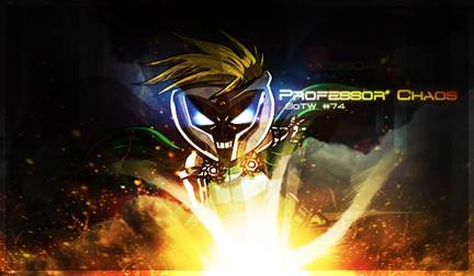
FIRST PLACE and PUBLIC FAVOURITE: Mr Rockeye - 98/160
[x]
- Josh's critique - 22:
- Idea: 6/10
Technical: 5/10
Typography: 6/10
Execution: 5/10
Total: 22/40
Its a very interesting style. It almost reminds me of a sprite tag. I think you could have done a lot better on the effect not making them so bright. The border is unneeded. Overall not bad.
- Leakee's critique - 28:
- Idea: 6/10
Technical: 6/10
Typography: 9/10
Execution: 7/10
Overall: 28/10
I like it, you managed to pull it off well however the shape of the signature is bad, maybe try to have less verticular (If that's even a word) length. Really love the typography in this piece.
- Kelly's critique - 23:
- Idea: 6.5/10
Technical: 5/10
Typography: 6/10
Execution: 5.5/10
Overall: 23/40
Explanation: The top is quite blank, so you could have probably made the piece a bit smaller (just by removing the top part when you crop it). The idea behind this is not bad at all, and you did an alright job executing it, but the text is a bit long and a bit too far up, I would recommend having it below the renders' arm instead of above, and probably would have opted for something like "Prof. Chaos" or something to shorten it. Not bad though! I like the choice in effects and it's colorful, strikes me as a sprite piece, like Josh said.
- Minato's critique - 25:
- Idea: 8/10
Technical: 8/10
Typography: 9/10
Execution: 8/10
I like the piece, it has a dark feeling to it. Although the idea was Heroes vs Villains, not just villains so I can't let you have max points. As mentioned before I had a look at the explosion/yellow thing and it might be too bright, other than that it's a great piece. Something a person could definitely proud of.
SECOND PLACE: Valets - 45/160
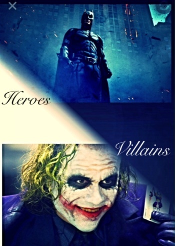
- Josh's critique - 6:
- Idea: 3/10
Technical: 1/10
Typography: 1/10
Execution: 1/10
Total: 6/40
Hope i'm not to harsh here. It doesn't look like that much time was taken making this. It literally just looks like 2 pictures murdered together, and then you added text. I wouldn't even really consider it a tag. Please take some time and look up tutorials. If you need advice we are always in our IRC channel.
- Leakee's critique - 9.5:
- Idea: 3.5/10
Technical: 2/10
Typography: 2/10
Execution: 2/10
Overall: 9.5/10
Decent way to get both the hero and the villain in there, however it would have been much better just to have one character like the other two signatures.
- Kelly's critique - 9.5:
- Idea: 3.5/10
Technical: 2/10
Typography: 2/10
Execution: 2/10
Overall: 9.5/10
Explanation: The idea of having both the villain and the superhero in the same piece is a good one, but not very well executed. I feel it would be good to look through some tutorials to familiarize yourself some more with the tools of the program you're using, maybe also join #design (the official graphic IRC channel) and we can give you some tips, too.
- Minato's critique - 20:
- Idea: 5/10
Technical: 5/10
Typography: 5/10
Execution: 5/10
The theme is Heroes vs Villains, Joker and Batman fit like a glove, but I don't really get the idea behind your signature. It's a of Batman and Joker, they're rivals and .... I don't think you have put effort in this piece, just put something quick together and left it be.
THIRD PLACE: feedpenguins - 38/160
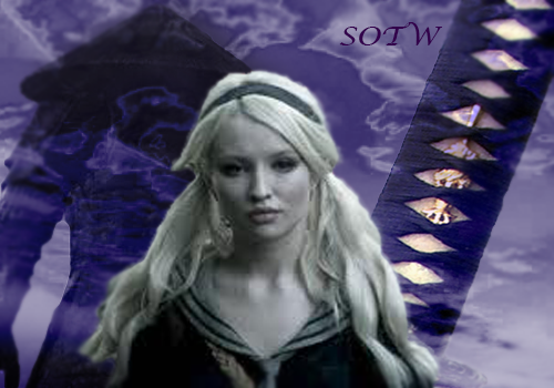
- Josh's critique - 10:
- Idea: 3/10
Technical: 2/10
Typography: 2/10
Execution: 3/10
Total:10/40
I dislike two tone signatures. Theres a lot going on in this sig that i have no idea what it is. In a signature you almost wanna create an environment and a story for your render. On this i just see a render and a lot of crazy effect behind it. I advice you to take a look at some tutorials, and check out our IRC channel. Keep it up you'll get there.
- Leakee's critique - 8:
Idea: 3/10
Technical: 2/10
Typography: 1/10
Execution: 2/10
Overall: 8/10
You have one render which is an advantage however you really need to look up some tutorials, it is way too big and has a lot of blank unused space. The text is bland and lacks P-zazz. Sorry
- Kelly's critique - 9:
- Idea: 3/10
Technical: 2/10
Typography: 2/10
Execution: 2/10
Overall: 9/10
Explanation: The background and the foreground (foreground being your render choice) don't really have any relation to them that I can see, and for this particular piece having it be two-toned is not a good idea, especially making your background the more brighter of the two. I feel it would be good to look through some tutorials to familiarize yourself some more with the tools of the program you're using, maybe also join #design (the official graphic IRC channel) and we can give you some tips, too.
- Minato's critique - 11:
- Idea: 3/10
Technical: 2/10
Typography: 4/10
Execution: 3/10
I don't get the idea, the only thing that comes to mind when I see it is Kill Bill movie series, but I don't remember them being characters in that series, so the idea behind it seems unclear to me. It seems like two images have just been put together and it isn't really good. I know that you're a beginner so I am pretty happy/proud that you were brave enough to enter, watch tutorials, come to #design to ask for help. Create, Critique, Improve.

Leakee- Grandmaster (2000 posts)
")
-

Re: Signature of the Week #74! Theme: Heroes vs Villains - WINNERS ANNOUNCED
![]() by Kelly 1/2/2014, 6:41 pm
by Kelly 1/2/2014, 6:41 pm
Good luck, everyone

Kelly- Grandmaster (2000 posts)
Re: Signature of the Week #74! Theme: Heroes vs Villains - WINNERS ANNOUNCED
![]() by Valets 3/2/2014, 7:18 pm
by Valets 3/2/2014, 7:18 pm
- Spoiler:

Last edited by Valets on 3/2/2014, 7:26 pm; edited 1 time in total
Valets- Tier 2 (100 posts)
")
Re: Signature of the Week #74! Theme: Heroes vs Villains - WINNERS ANNOUNCED
![]() by Leakee 3/2/2014, 7:25 pm
by Leakee 3/2/2014, 7:25 pm
Valets wrote:Goodluck all :s i hope im doing this right
- Spoiler:

Good! Althought its Super Big, maybe try scaling it down a bit?
Leakee- Grandmaster (2000 posts)
-
Re: Signature of the Week #74! Theme: Heroes vs Villains - WINNERS ANNOUNCED
![]() by Valets 3/2/2014, 7:28 pm
by Valets 3/2/2014, 7:28 pm
Valets- Tier 2 (100 posts)
Re: Signature of the Week #74! Theme: Heroes vs Villains - WINNERS ANNOUNCED
![]() by Inhaps 3/2/2014, 7:33 pm
by Inhaps 3/2/2014, 7:33 pm
Valets wrote:Goodluck all :s i hope im doing this right
- Spoiler:
It's just a bit too large. Yours is 456x640 but it should be 350x500 at most. I've resized it for you.
- resized image:
I also suggest using Imgur or Photobucket to upload your images with no quality loss.

Inhaps- Grandmaster (2000 posts)
Re: Signature of the Week #74! Theme: Heroes vs Villains - WINNERS ANNOUNCED
![]() by Valets 3/2/2014, 8:26 pm
by Valets 3/2/2014, 8:26 pm
Valets- Tier 2 (100 posts)
Re: Signature of the Week #74! Theme: Heroes vs Villains - WINNERS ANNOUNCED
![]() by Kelly 5/2/2014, 7:12 pm
by Kelly 5/2/2014, 7:12 pm
Kelly- Grandmaster (2000 posts)
Re: Signature of the Week #74! Theme: Heroes vs Villains - WINNERS ANNOUNCED
![]() by Leakee 5/2/2014, 8:03 pm
by Leakee 5/2/2014, 8:03 pm
Leakee- Grandmaster (2000 posts)
-
Re: Signature of the Week #74! Theme: Heroes vs Villains - WINNERS ANNOUNCED
![]() by Mr Rockeye 5/2/2014, 9:50 pm
by Mr Rockeye 5/2/2014, 9:50 pm
- Signature:

Sized down version:
- second attempt:
Put more detail in the hair and a bit better placing of the text
- Proof of the render:

Last edited by Mr Rockeye on 8/2/2014, 11:22 am; edited 3 times in total

Mr Rockeye- Tier 4 (500 posts)
")
Re: Signature of the Week #74! Theme: Heroes vs Villains - WINNERS ANNOUNCED
![]() by Leakee 5/2/2014, 10:06 pm
by Leakee 5/2/2014, 10:06 pm
Mr Rockeye wrote:My entry:
- Signature:
Choose the villain because why not?
- Proof of the render:
Epic Villain
Leakee- Grandmaster (2000 posts)
-
Re: Signature of the Week #74! Theme: Heroes vs Villains - WINNERS ANNOUNCED
![]() by Mr Rockeye 5/2/2014, 10:38 pm
by Mr Rockeye 5/2/2014, 10:38 pm
Leakee wrote:Mr Rockeye wrote:My entry:
- Signature:
Choose the villain because why not?
- Proof of the render:
Epic Villain
Thanks xD tried my best and butters for the win!
Mr Rockeye- Tier 4 (500 posts)
Re: Signature of the Week #74! Theme: Heroes vs Villains - WINNERS ANNOUNCED
![]() by Valets 5/2/2014, 11:42 pm
by Valets 5/2/2014, 11:42 pm
Valets- Tier 2 (100 posts)
Re: Signature of the Week #74! Theme: Heroes vs Villains - WINNERS ANNOUNCED
![]() by feedpenguins 6/2/2014, 12:56 am
by feedpenguins 6/2/2014, 12:56 am
Signature
- Spoiler:
- Spoiler:


feedpenguins- Tier 2 (100 posts)
Re: Signature of the Week #74! Theme: Heroes vs Villains - WINNERS ANNOUNCED
![]() by Inhaps 6/2/2014, 9:20 am
by Inhaps 6/2/2014, 9:20 am
Inhaps- Grandmaster (2000 posts)
Re: Signature of the Week #74! Theme: Heroes vs Villains - WINNERS ANNOUNCED
![]() by DoYouPlay_RS 10/2/2014, 1:22 am
by DoYouPlay_RS 10/2/2014, 1:22 am

DoYouPlay_RS- Grandmaster (2000 posts)
-
Re: Signature of the Week #74! Theme: Heroes vs Villains - WINNERS ANNOUNCED
![]() by Tuff Tiga 10/2/2014, 3:12 am
by Tuff Tiga 10/2/2014, 3:12 am

Tuff Tiga- Grandmaster (2000 posts)
Re: Signature of the Week #74! Theme: Heroes vs Villains - WINNERS ANNOUNCED
![]() by Kelly 11/2/2014, 10:17 pm
by Kelly 11/2/2014, 10:17 pm
Kelly- Grandmaster (2000 posts)
Re: Signature of the Week #74! Theme: Heroes vs Villains - WINNERS ANNOUNCED
![]() by Blackyy 12/2/2014, 4:20 am
by Blackyy 12/2/2014, 4:20 am
I thought Mr Rockeyes one was okay, like if I had to grade it, I would say that the background is sick, the focal point is good, the effects are great but I would have loved if you put a vilain and a heroe in it like Valets did just to show a fight a conflict in the picture or something.
About feedpenguins sig, I would say that I have no idea what you tried to do, it looked to me that you were high as fuck and that you put things all together to participate in the competition. I am not saying its shit, because I am 10x worse then this but I am saying that you have to show a clear idea of what you want to show in your next try and improve your effects. Good luck
I should be studying and I am writting an essay about sigs, fucking jesus christ fucking shit
Blackyy- Forum Master (1500 posts)
")
Re: Signature of the Week #74! Theme: Heroes vs Villains - WINNERS ANNOUNCED
![]() by feedpenguins 12/2/2014, 5:24 am
by feedpenguins 12/2/2014, 5:24 am
feedpenguins- Tier 2 (100 posts)
Re: Signature of the Week #74! Theme: Heroes vs Villains - WINNERS ANNOUNCED
![]() by Mr Rockeye 12/2/2014, 7:55 am
by Mr Rockeye 12/2/2014, 7:55 am
feedpenguins wrote:wow i feel like i just got kicked in the chest. this was my first attempt at a sig like i said im noob to photoshop but thanks for your advice and ill keep it in mind for next time
Don't worry, there are always things to improve.
My signature is also not perfect, all you need to do is watch some YouTube guides.
Those guides helped me out a ton.
Remember you will always have failing pieces but it's what makes your art better.
Mr Rockeye- Tier 4 (500 posts)
Re: Signature of the Week #74! Theme: Heroes vs Villains - WINNERS ANNOUNCED
![]() by feedpenguins 12/2/2014, 9:24 am
by feedpenguins 12/2/2014, 9:24 am
Mr Rockeye wrote:feedpenguins wrote:wow i feel like i just got kicked in the chest. this was my first attempt at a sig like i said im noob to photoshop but thanks for your advice and ill keep it in mind for next time
Don't worry, there are always things to improve.
My signature is also not perfect, all you need to do is watch some YouTube guides.
Those guides helped me out a ton.
Remember you will always have failing pieces but it's what makes your art better.
thank you
ive been reading tutorials. i find that the ones that are typed with pictures are better cause then you dont have to pause the videos or go back in the video if you have missed something
feedpenguins- Tier 2 (100 posts)
Re: Signature of the Week #74! Theme: Heroes vs Villains - WINNERS ANNOUNCED
![]() by Leakee 12/2/2014, 2:13 pm
by Leakee 12/2/2014, 2:13 pm
feedpenguins wrote:Mr Rockeye wrote:feedpenguins wrote:wow i feel like i just got kicked in the chest. this was my first attempt at a sig like i said im noob to photoshop but thanks for your advice and ill keep it in mind for next time
Don't worry, there are always things to improve.
My signature is also not perfect, all you need to do is watch some YouTube guides.
Those guides helped me out a ton.
Remember you will always have failing pieces but it's what makes your art better.
thank you
ive been reading tutorials. i find that the ones that are typed with pictures are better cause then you dont have to pause the videos or go back in the video if you have missed something
Try deviantart, that is where I learned how to do them. Search 'forum signature tutorial'.
Leakee- Grandmaster (2000 posts)
-
Re: Signature of the Week #74! Theme: Heroes vs Villains - WINNERS ANNOUNCED
![]() by feedpenguins 12/2/2014, 3:22 pm
by feedpenguins 12/2/2014, 3:22 pm
Leakee wrote:feedpenguins wrote:Mr Rockeye wrote:feedpenguins wrote:wow i feel like i just got kicked in the chest. this was my first attempt at a sig like i said im noob to photoshop but thanks for your advice and ill keep it in mind for next time
Don't worry, there are always things to improve.
My signature is also not perfect, all you need to do is watch some YouTube guides.
Those guides helped me out a ton.
Remember you will always have failing pieces but it's what makes your art better.
thank you
ive been reading tutorials. i find that the ones that are typed with pictures are better cause then you dont have to pause the videos or go back in the video if you have missed something
Try deviantart, that is where I learned how to do them. Search 'forum signature tutorial'.
lots of good helpful tutorials. thank you so much. these will keep me busy for a while
feedpenguins- Tier 2 (100 posts)
Re: Signature of the Week #74! Theme: Heroes vs Villains - WINNERS ANNOUNCED
![]() by Valets 12/2/2014, 8:44 pm
by Valets 12/2/2014, 8:44 pm
Valets- Tier 2 (100 posts)
Sponsored content
Page 1 of 2 • 1, 2 ![]()
» Signature of the Week #82! Theme: Robots! - WINNERS ANNOUNCED
» Signature of the Week #86! Theme: Emotion - WINNERS ANNOUNCED
» Signature of the Week #83! Theme: Animals - WINNERS ANNOUNCED
» Signature of the Week #84! Theme: Seasons! - WINNERS ANNOUNCED
Index :: Social :: Graphics :: Graphics Archive